Pickles, Illustrated
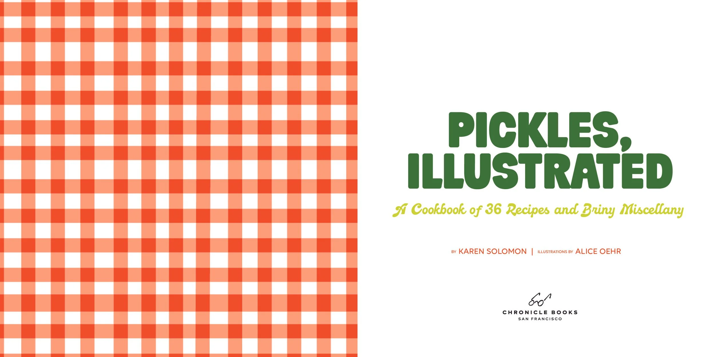
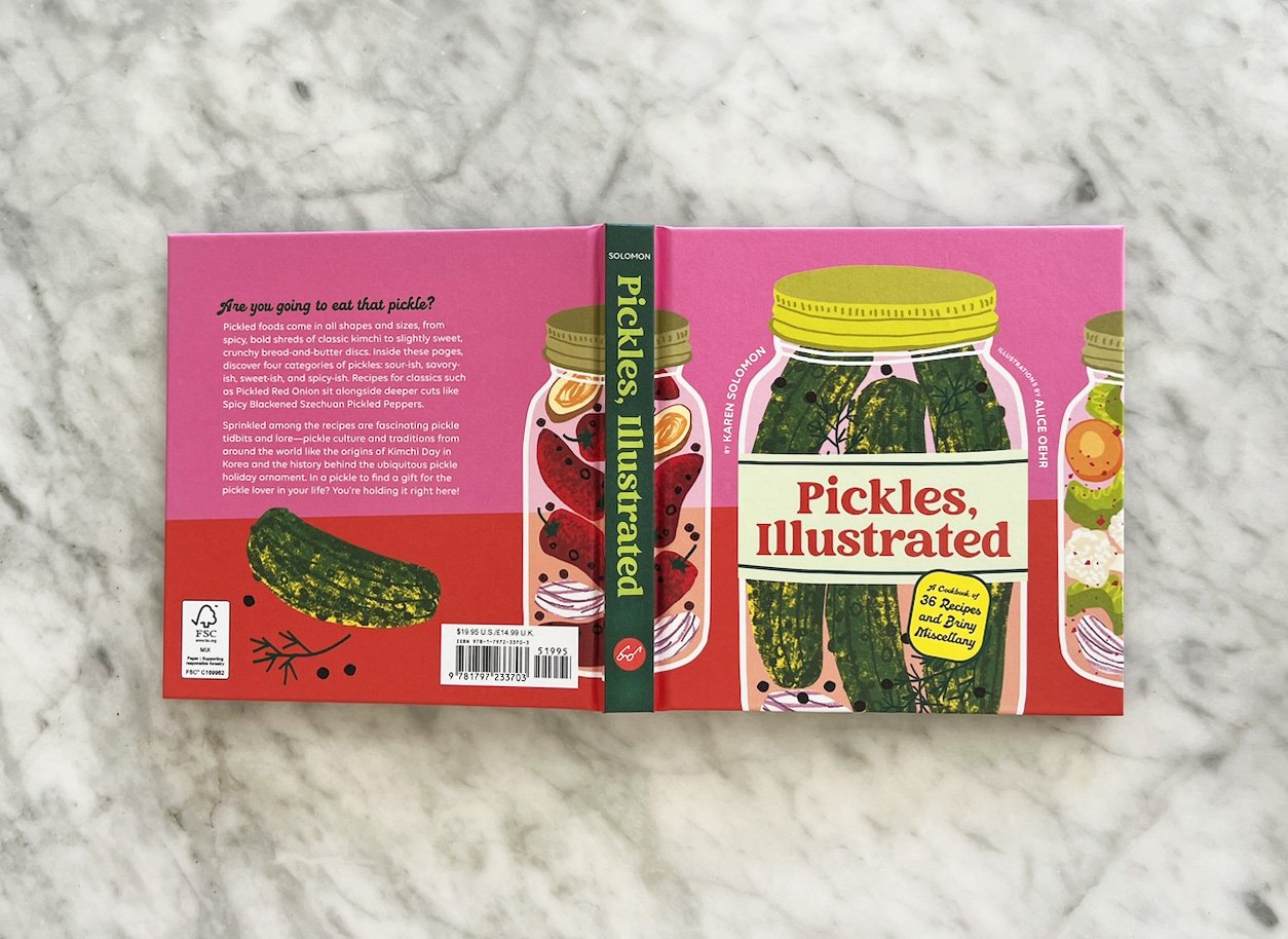
From Karen Solomon, an authoritative author in the pickling and preserving space, comes this small illustrated gift book celebrating the undersung side dish of meals and snacks around the world: pickles.
ROLE
Design (Cover + Interior)
COLLABORATORS
Creative Director: Wynne Au-Yeung
Author: Karen Solomon
Illustrator: Alice Oehr
Editor: Alex Galou
Publisher: Chronicle Books
PROJECT SPECS
6 × 6” / 152 pages
Spot Gloss
Painted edges
Direction & Design
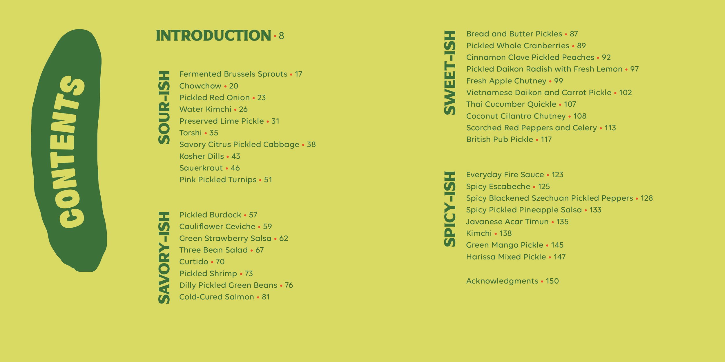
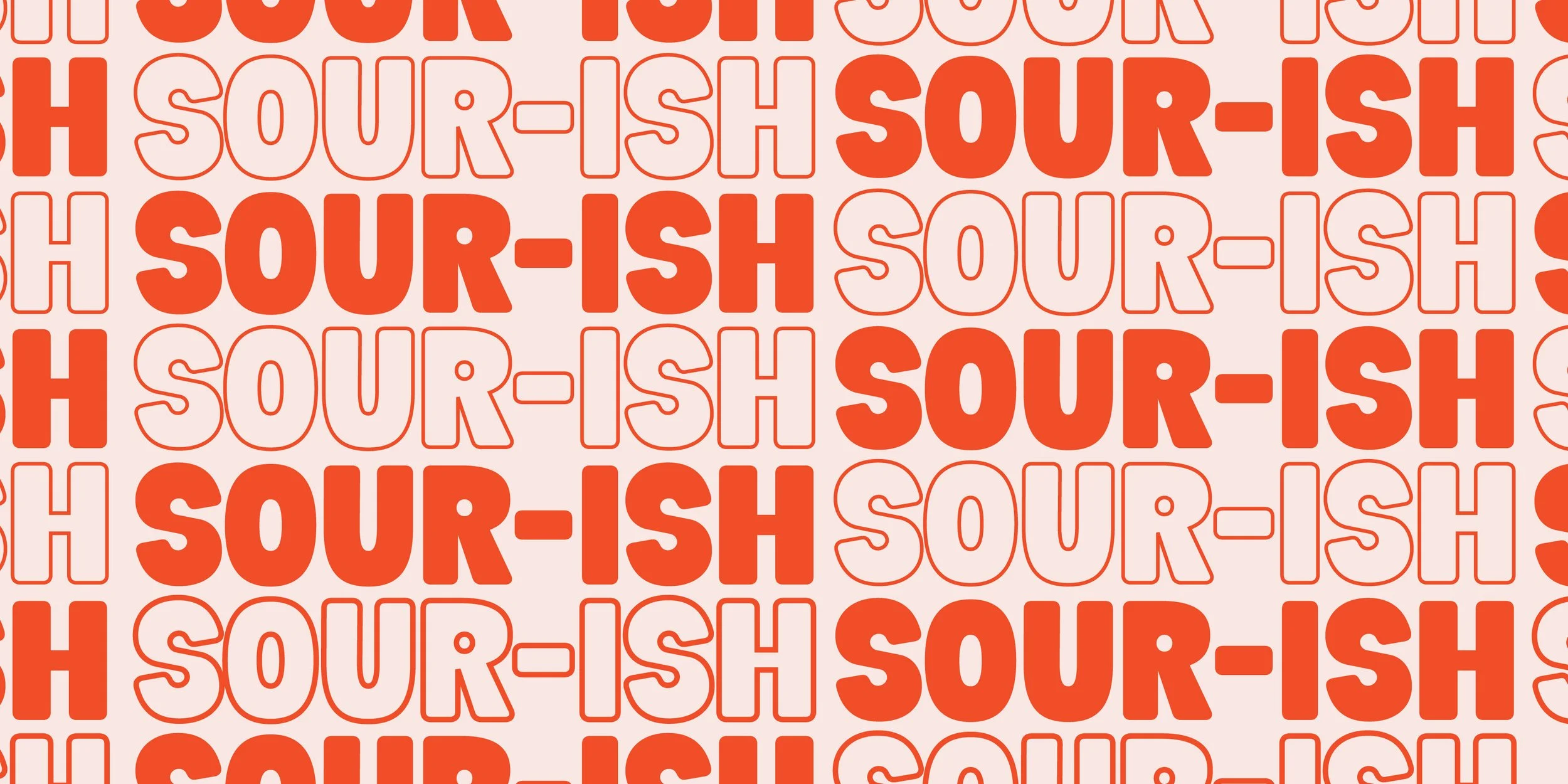
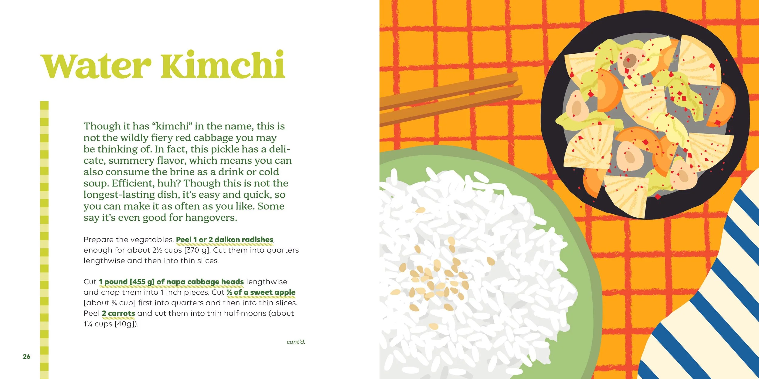
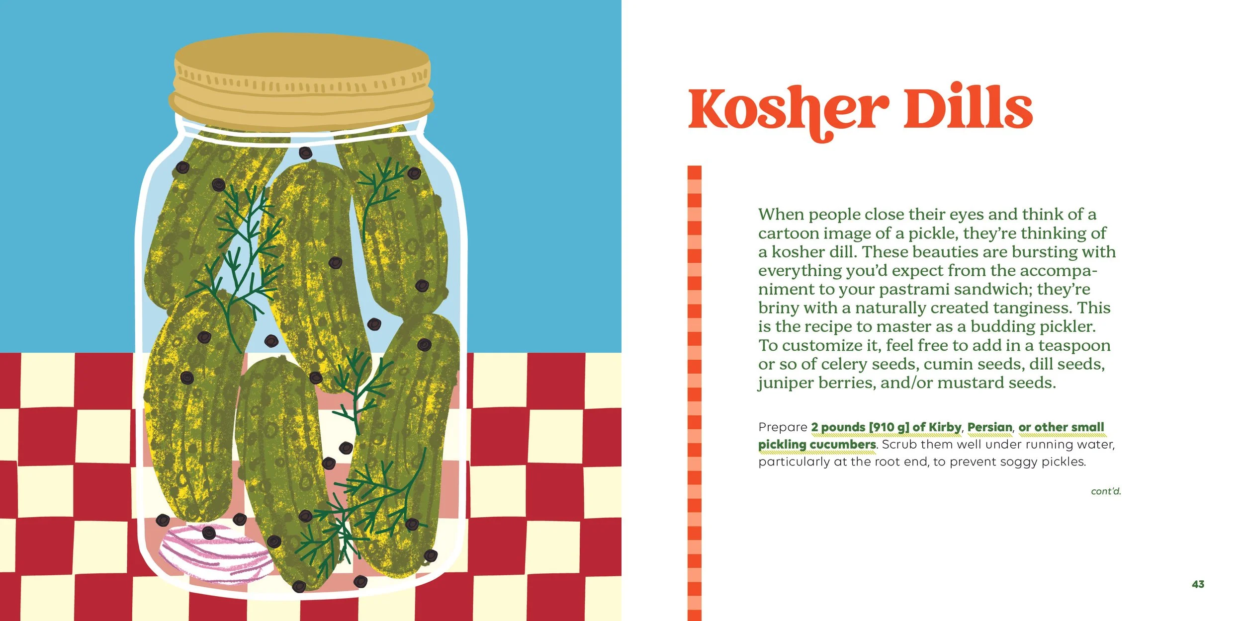
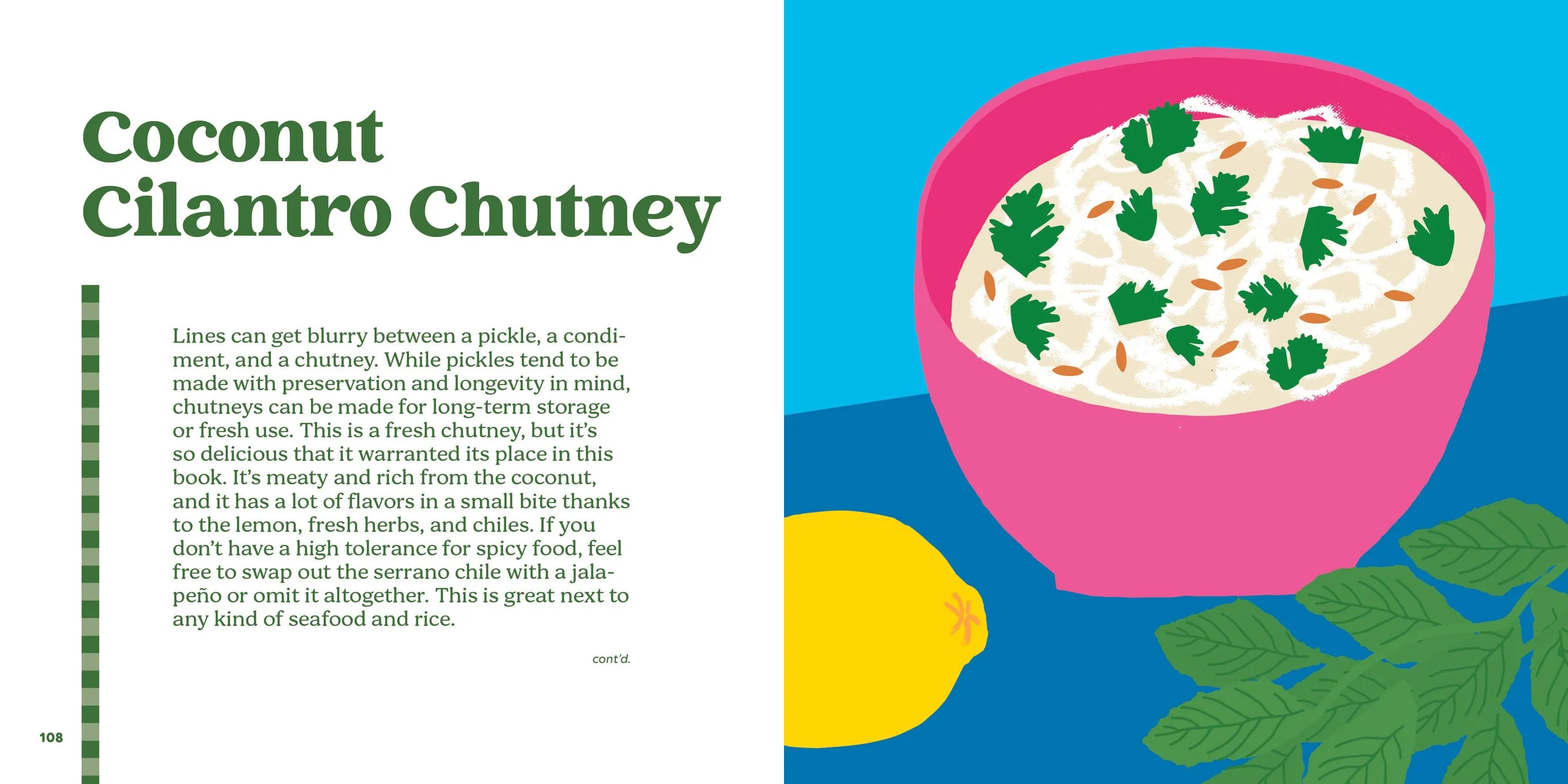
Organized by flavor profile (Sweet‑ish, Savory‑ish, Sour‑ish, and Spicy‑ish), Pickles, Illustrated explores forty briny recipes, from the classics like Kosher Dills to deeper cuts like Green Mango Pickle. The aim was to create a fun book that doesn’t take itself too seriously, chock full of pickly style.
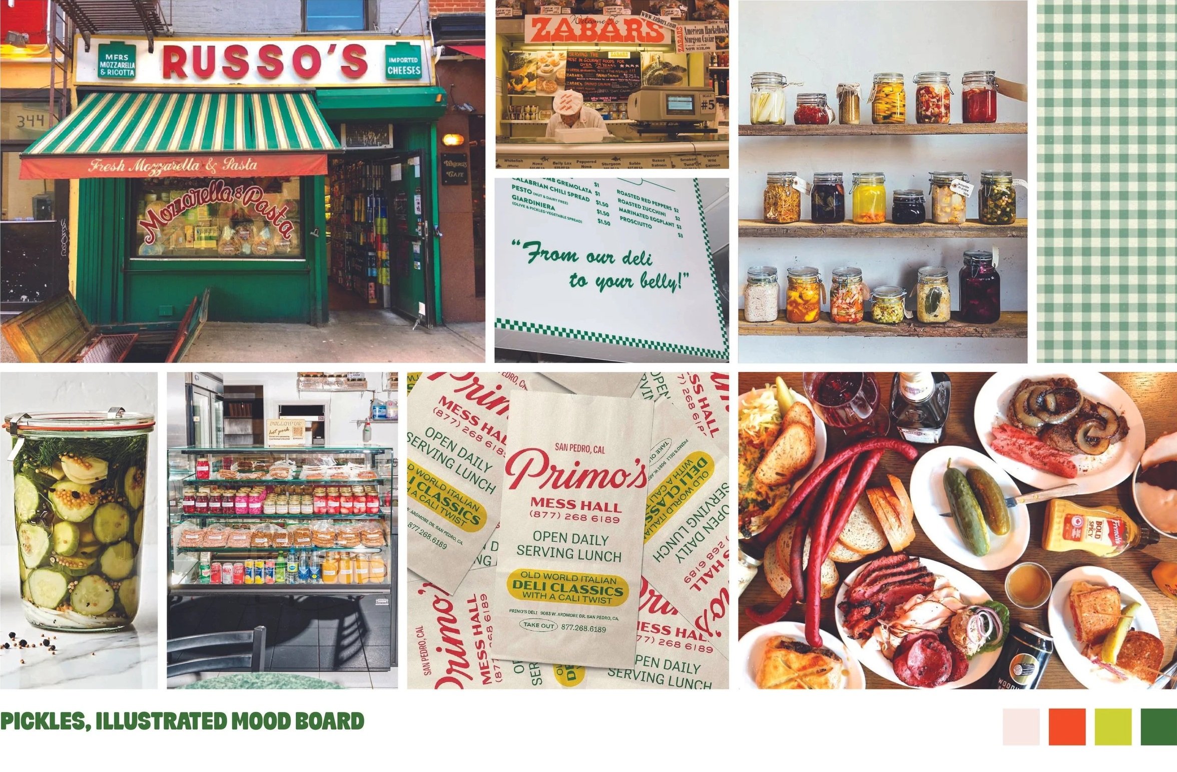
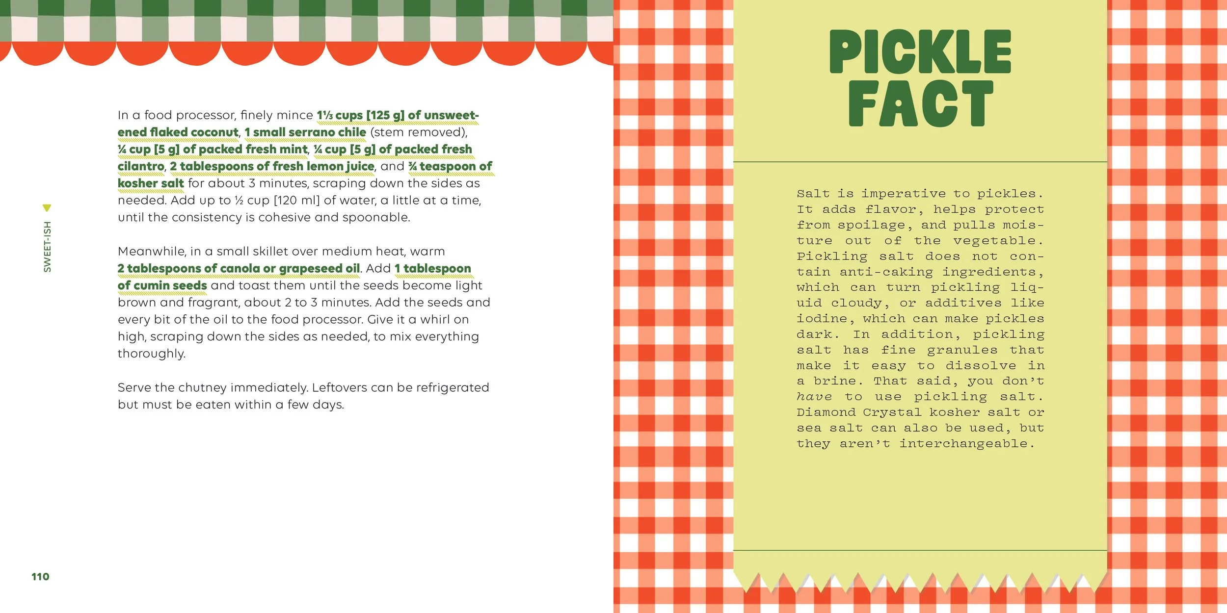
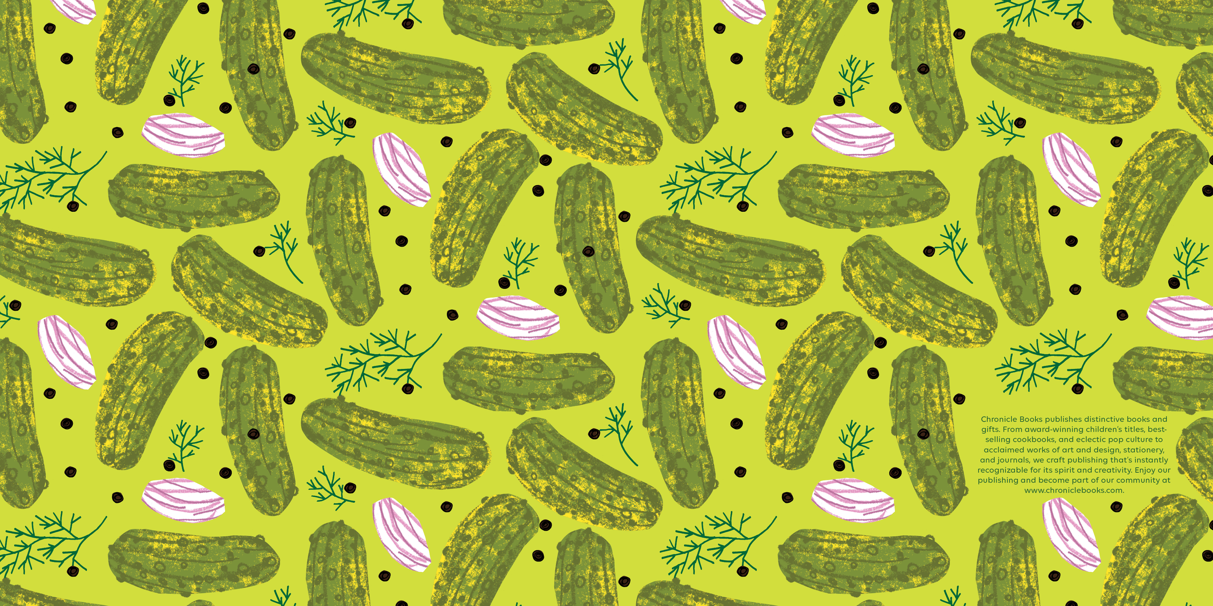
The design was inspired by old-school NYC delis and small grocery Americana, think appetizing nostalgia. Drew inspiration from hand-painted signage, striped awnings, gingham, butcher paper, and menu boards with expressive handlettering. The palette leaned heavily on pickle colors: a dark green and bright chartreuse, along with pops of orange.
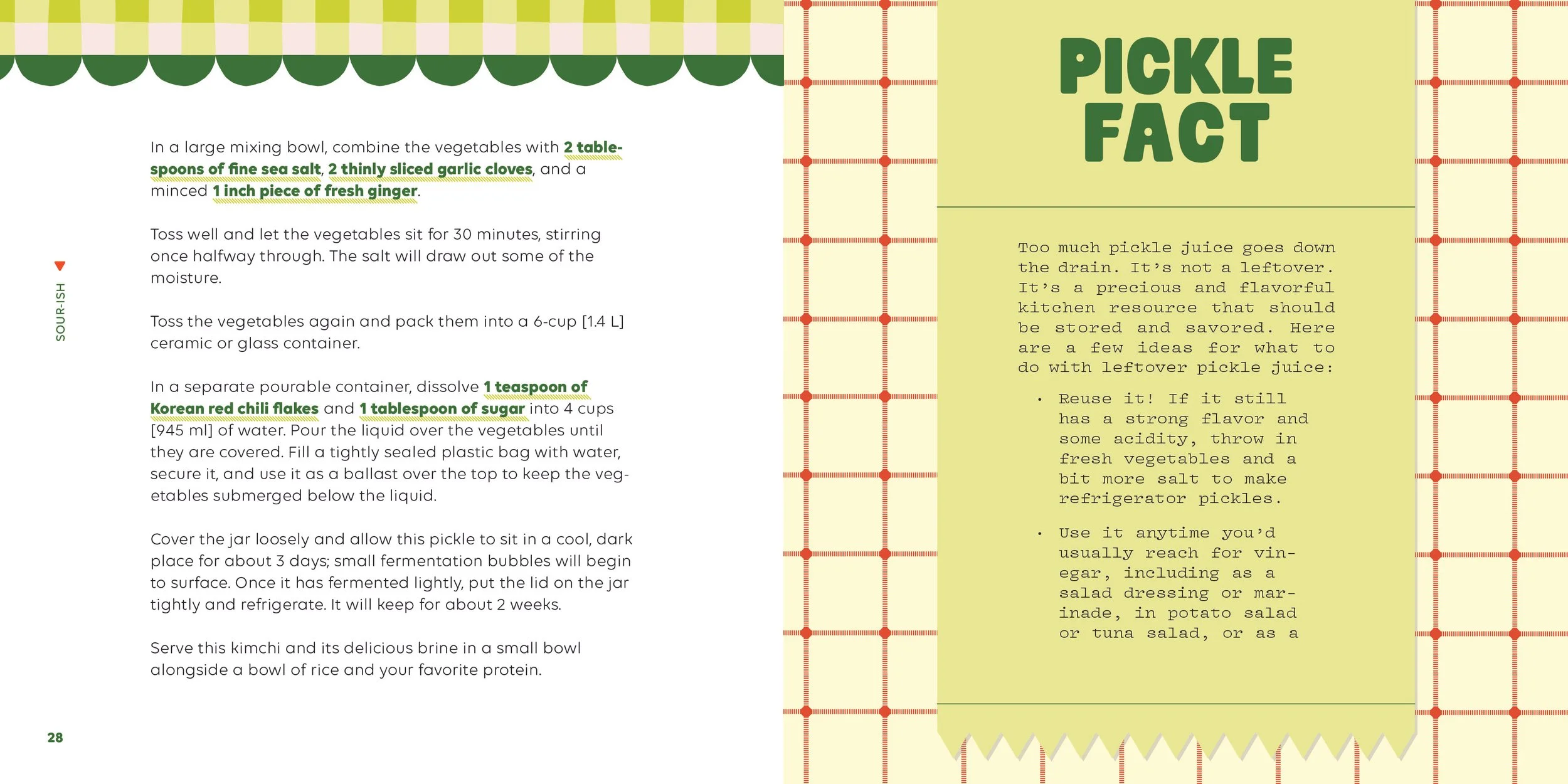
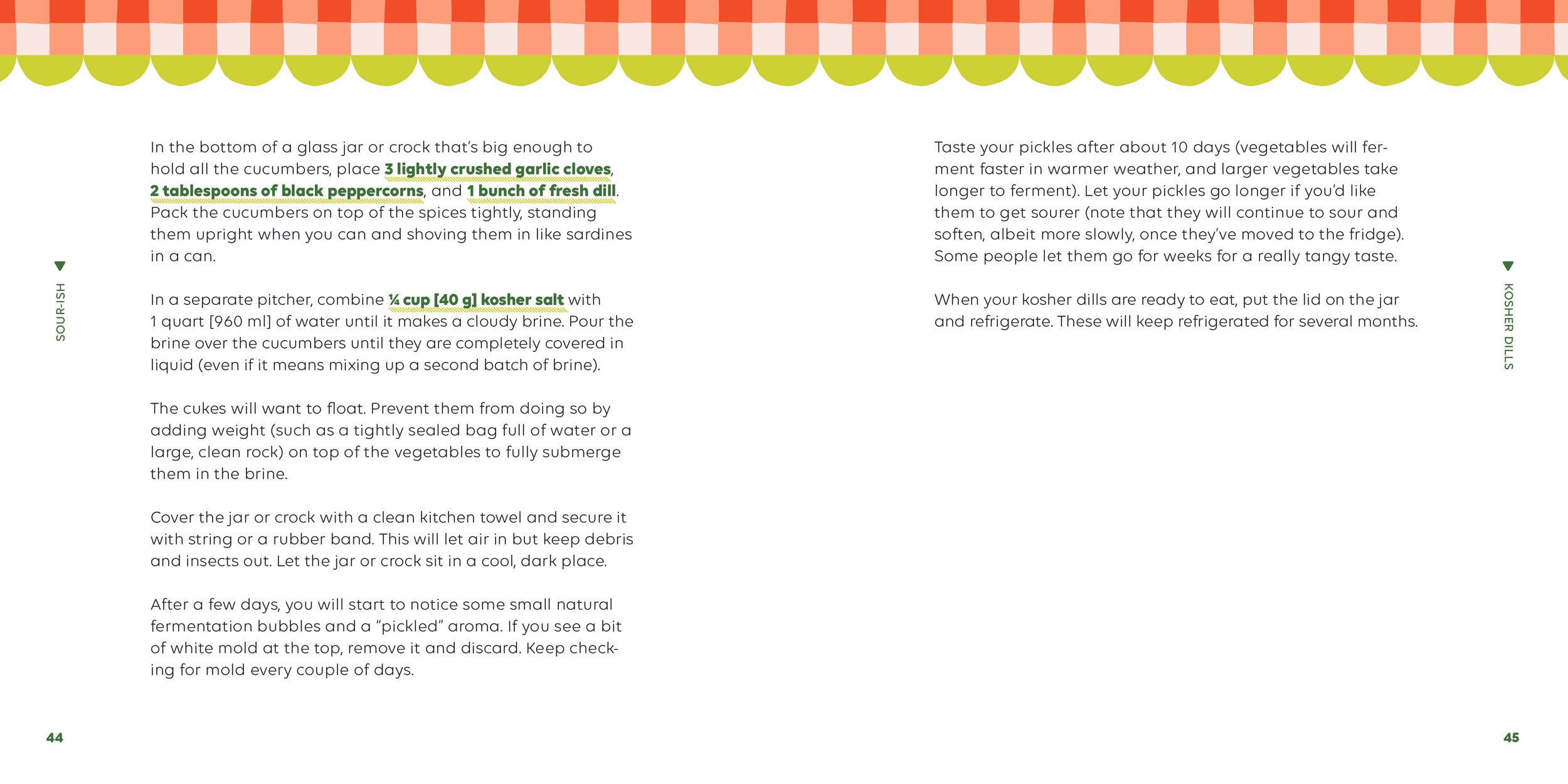
The focus of the book is the 40 fantastic recipes. For ease of use, ingredients were not separated out into an ingredient list, but rather left in-line in the text. To make sure that the ingredients stood out, they were spotlighted by setting the text in bold, dark green, and underlined in chartreuse.
To keep this book feeling fun and effervescent to match its subject matter, peppered throughout the recipes are fun and punchy pickle miscellany, from the history of Shakespearean turns of phrase like "in a pickle" to tips for what to do with leftover pickle juice.
One key consideration was that Pickles, Illustrated is the second installment of Chronicle Books’ food illustrated series. So the book needed to still feel in line with its predecessor while still unique to its content. To achieve this, the trim size is identical and kept with the painted edges. While the fonts used were unique to the book (lots of vintage serifs and scripts), the same hierarchy was maintained: using a bolder personality-filled serif for the headers throughout, paired with a sans-serif for the body text.