Outer Space Is Closer Than Antarctica:
And Other Things I Learned While Falling in Love at the Bottom of the World
ROLE
Design
COLLABORATORS
Creative Director: Allison Weiner
Author/ Illustrator: Michelle Ott
Editors: Natalie Butterfield, and Maya Wechsler
Publisher: Chronicle Books
PROJECT SPECS
6 × 8” / 168 pages
Textured spot UV
2 PMS colors
Part memoir, part atlas, and part almanac, this illustrated book by author and illustrator Michelle Ott tells a true story about falling in love at a remote research base and what Antarctic science can teach us about our place in the universe. A perfect blend of art and science, this motivational illustrated memoir explores themes of dreams and desire, leaving your comfort zone, finding yourself, and celebrating the simple joys of life.
Direction & Design
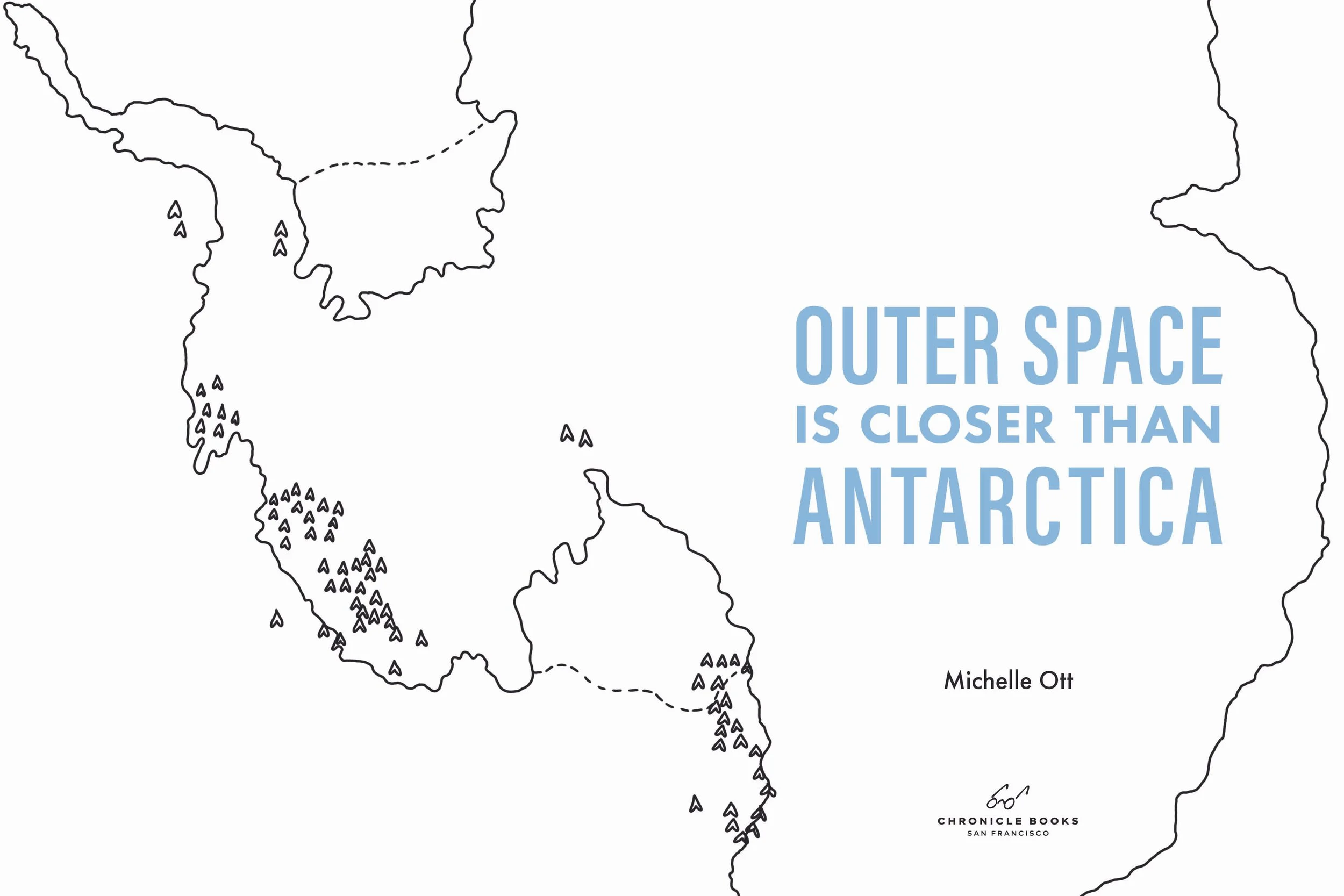
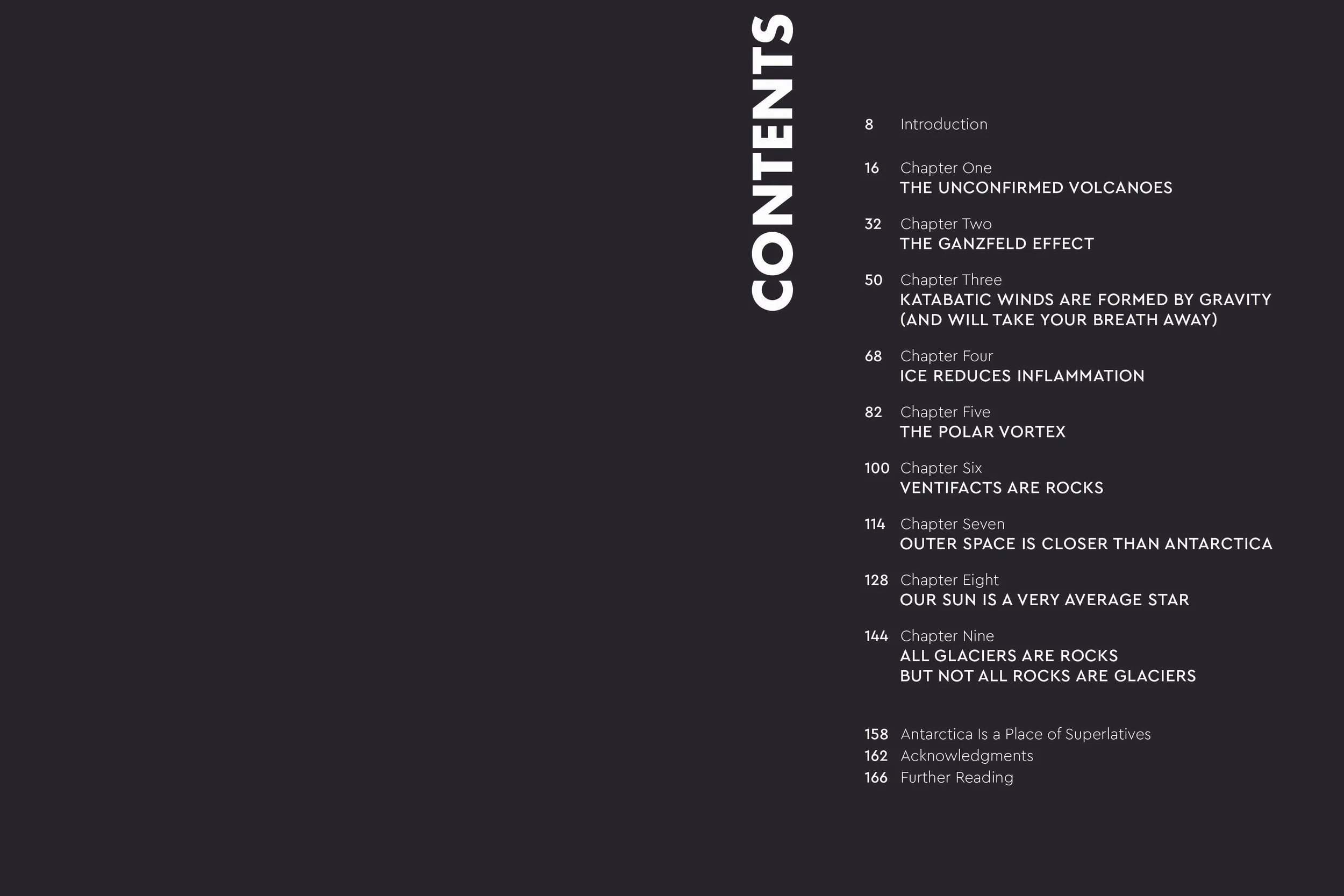
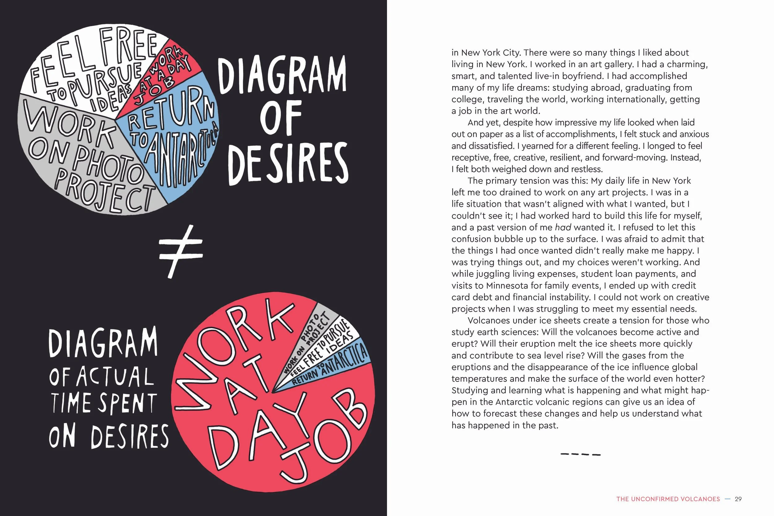
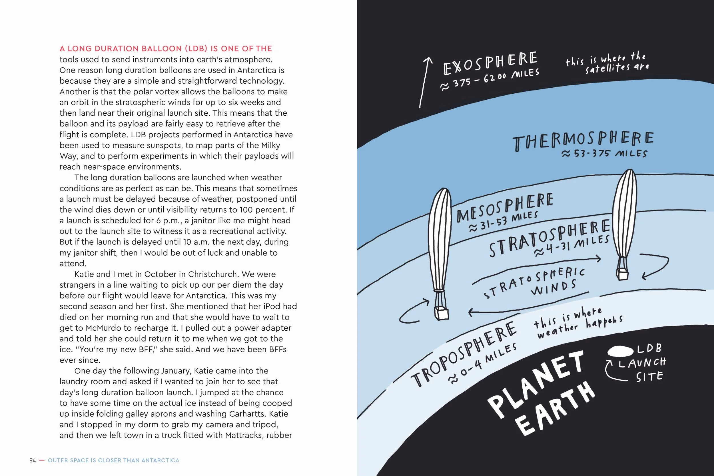
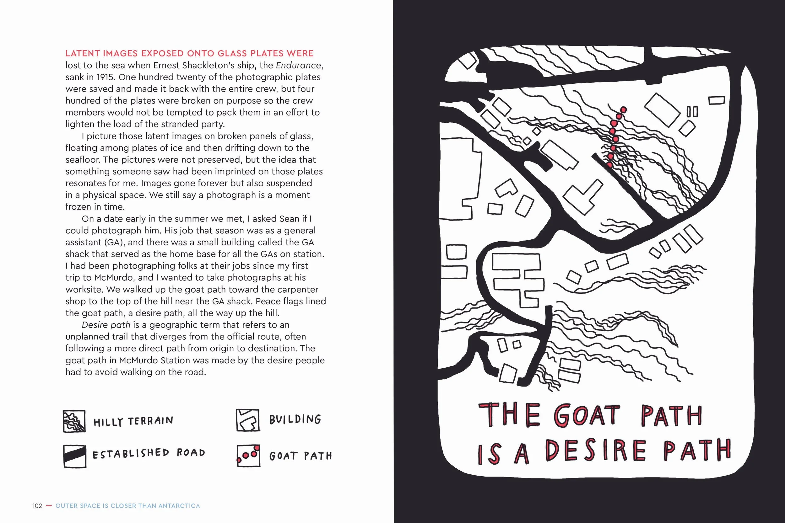
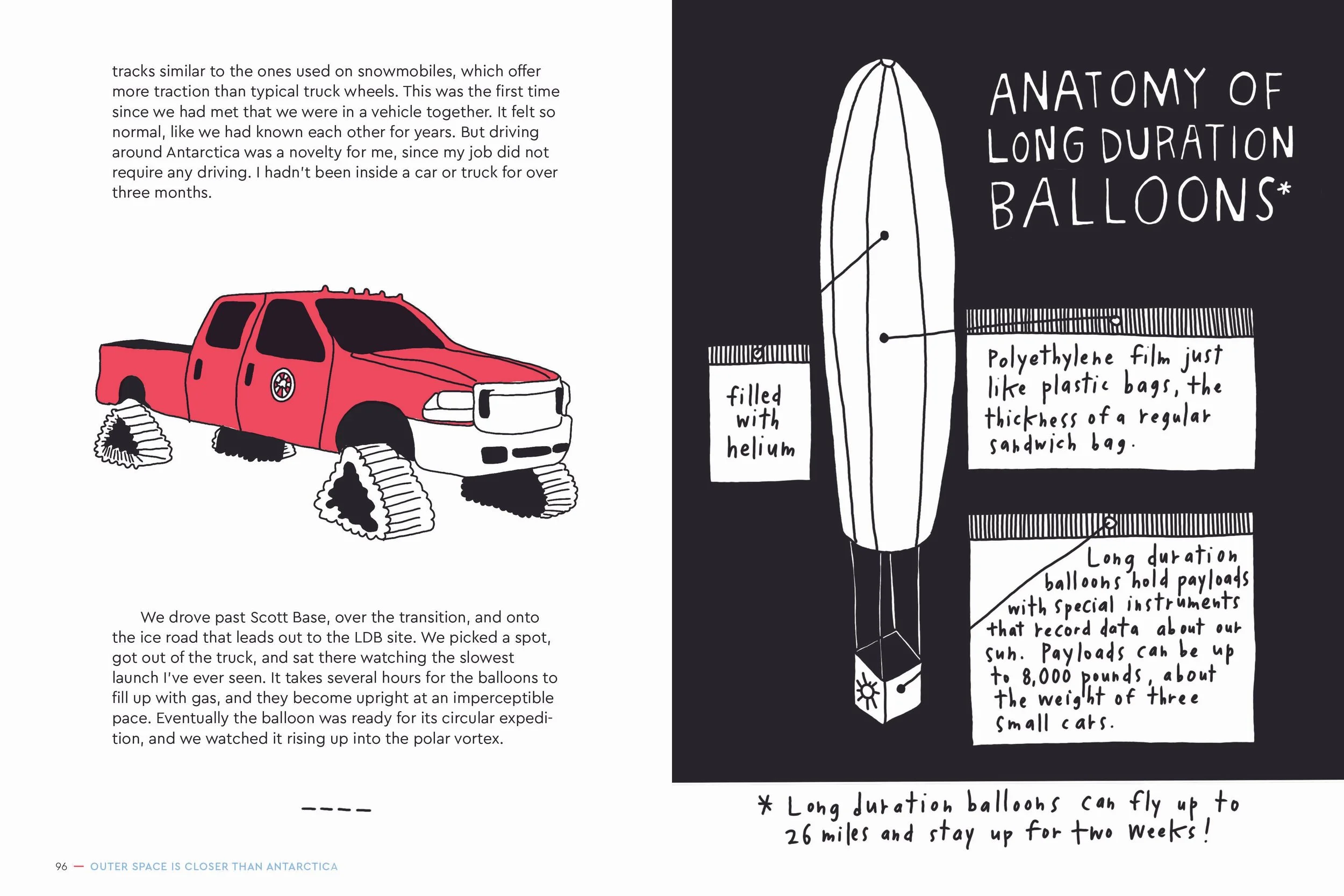
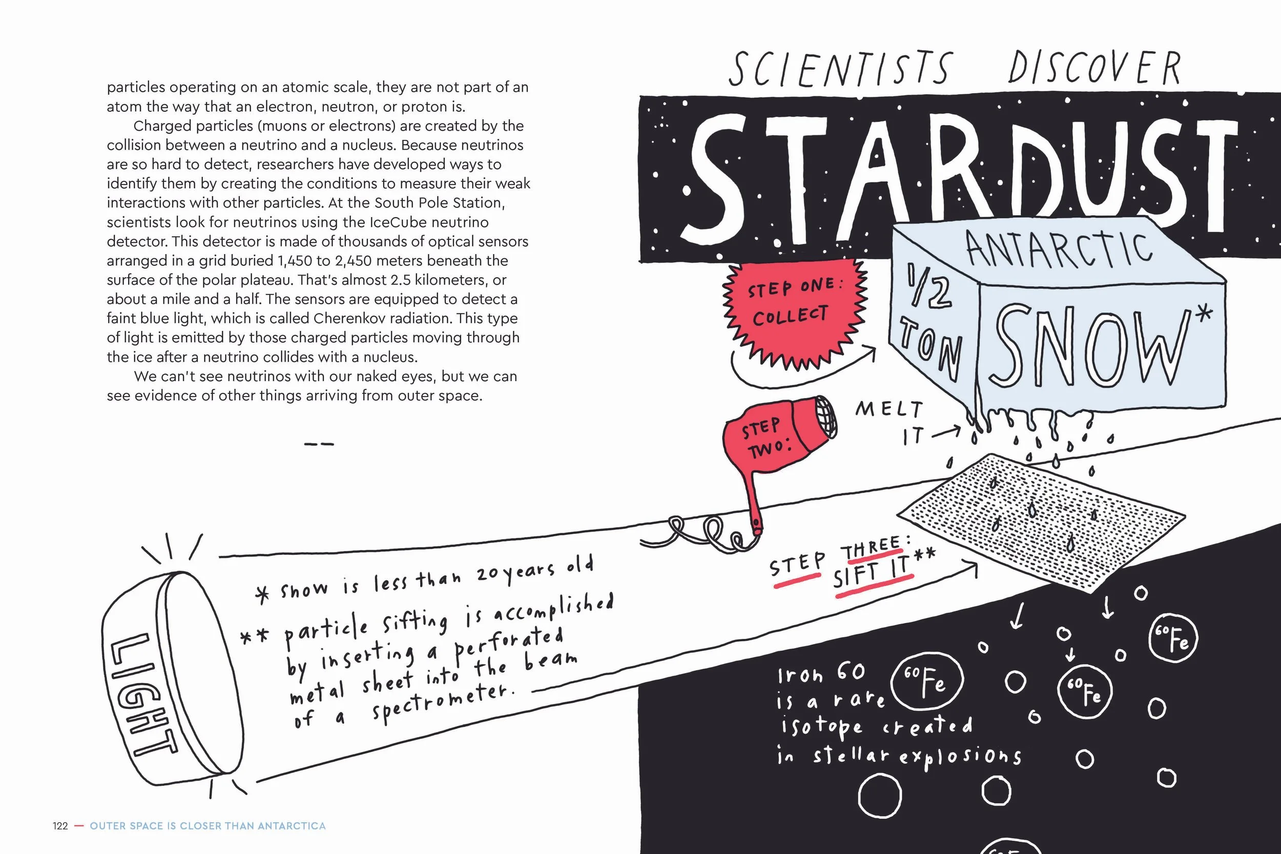
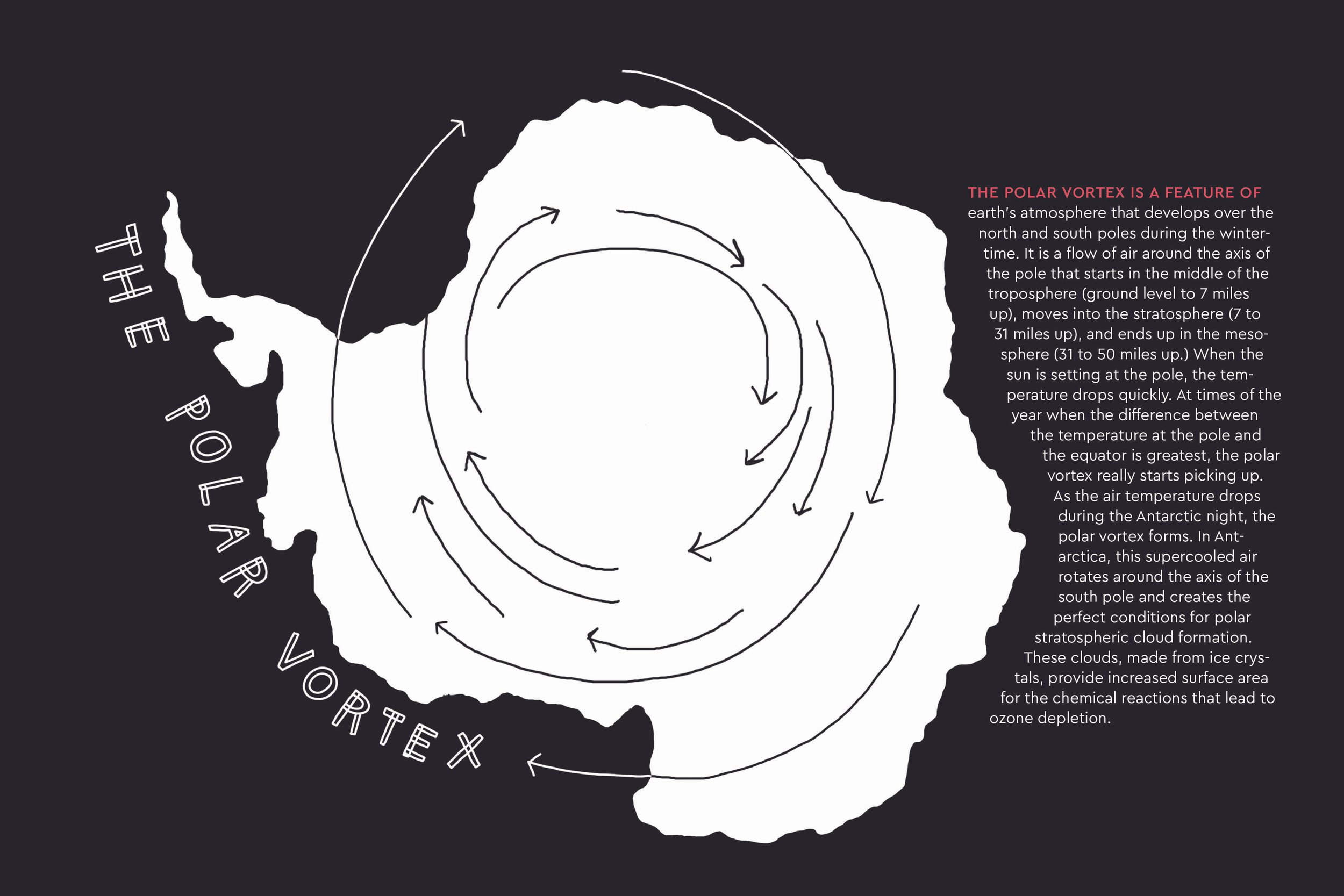
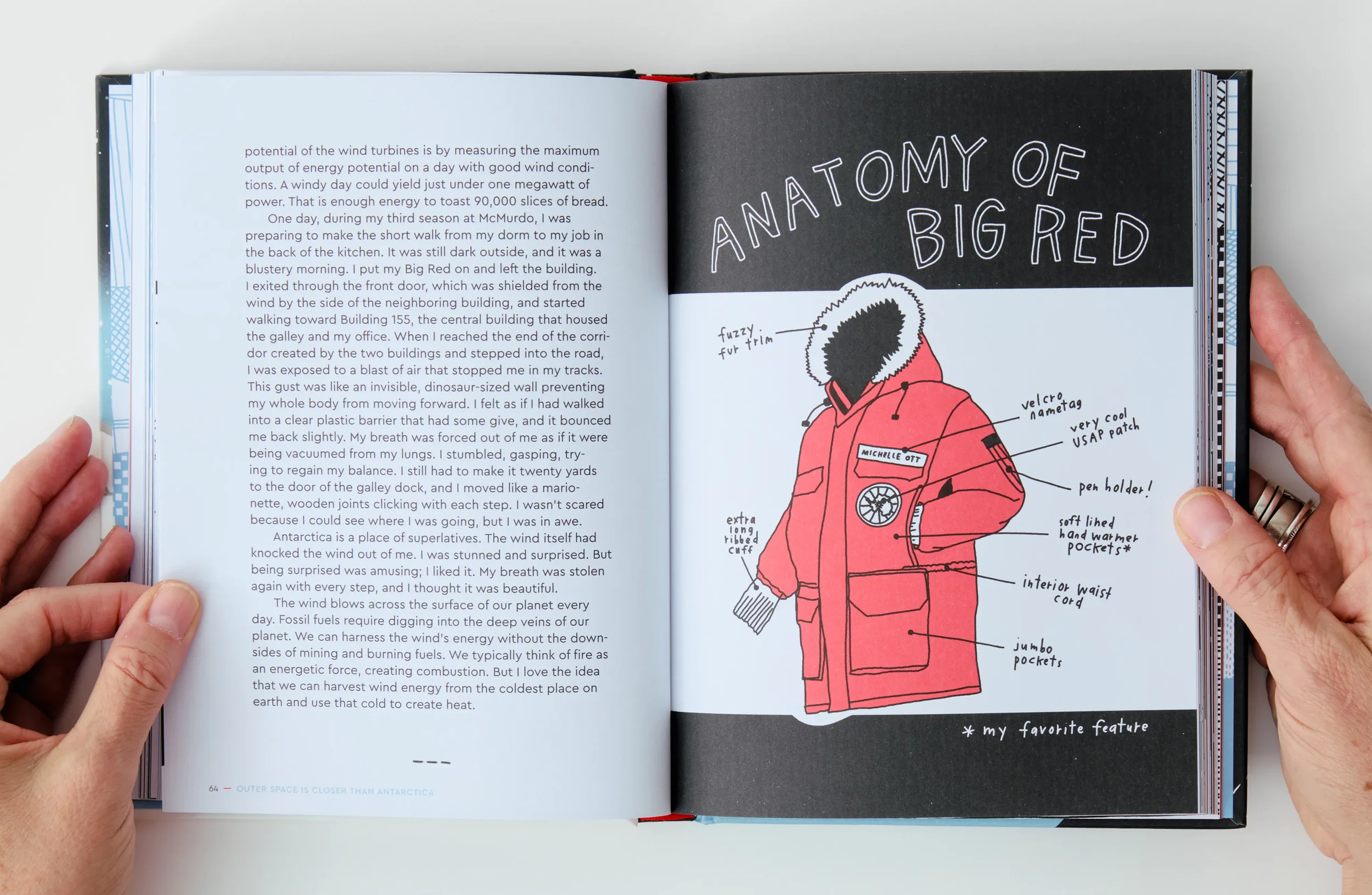
Organized into nine chapters, each detailing different geographic and geologic phenomena in Antarctica, Michelle Ott combines memorable stories about living and working at the Station with charming illustrations, hand-drawn maps, and accessible statistical data to illuminate important research conducted at the South Pole, as well as the emotional realizations and life lessons she learned there.
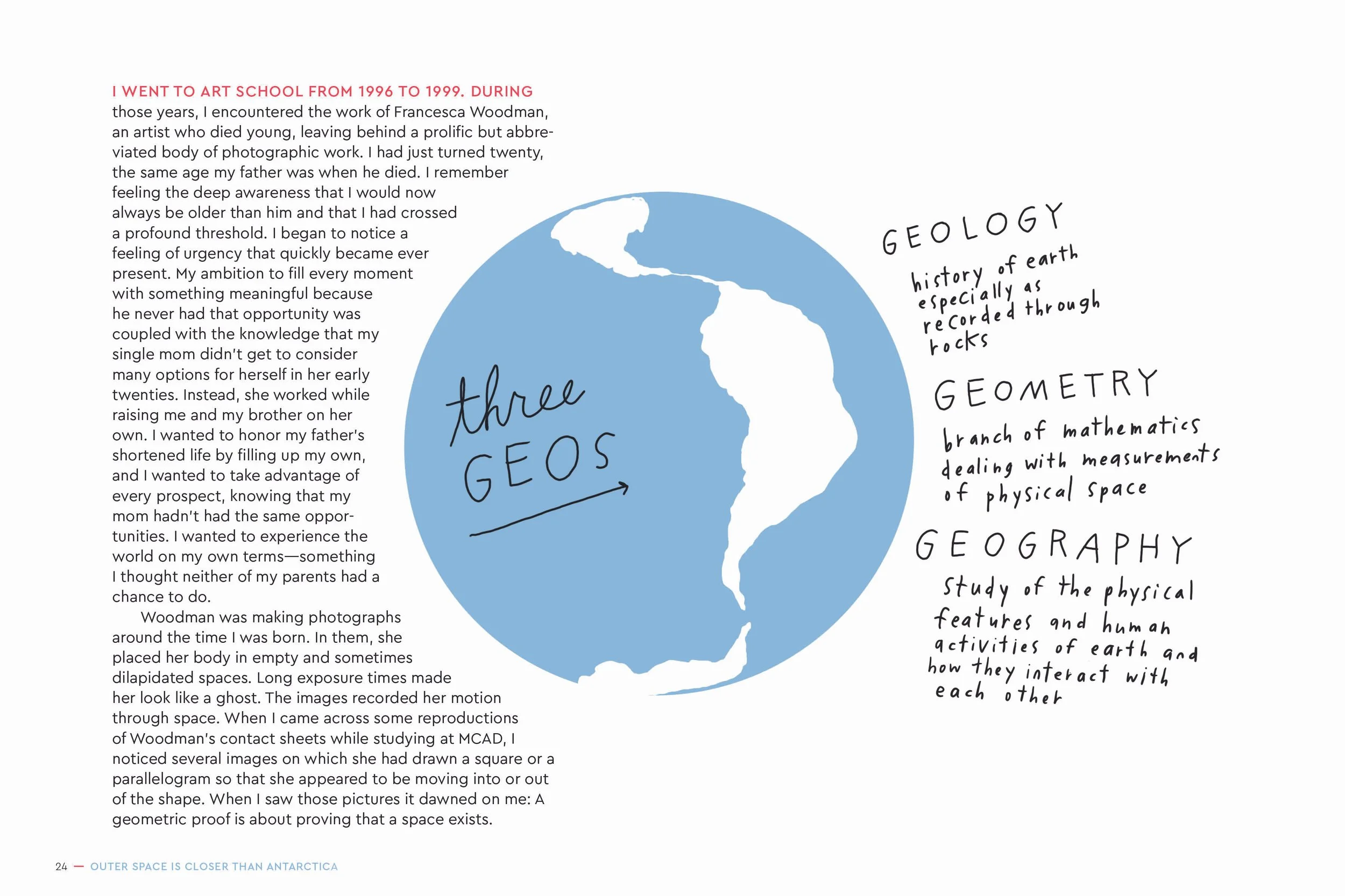
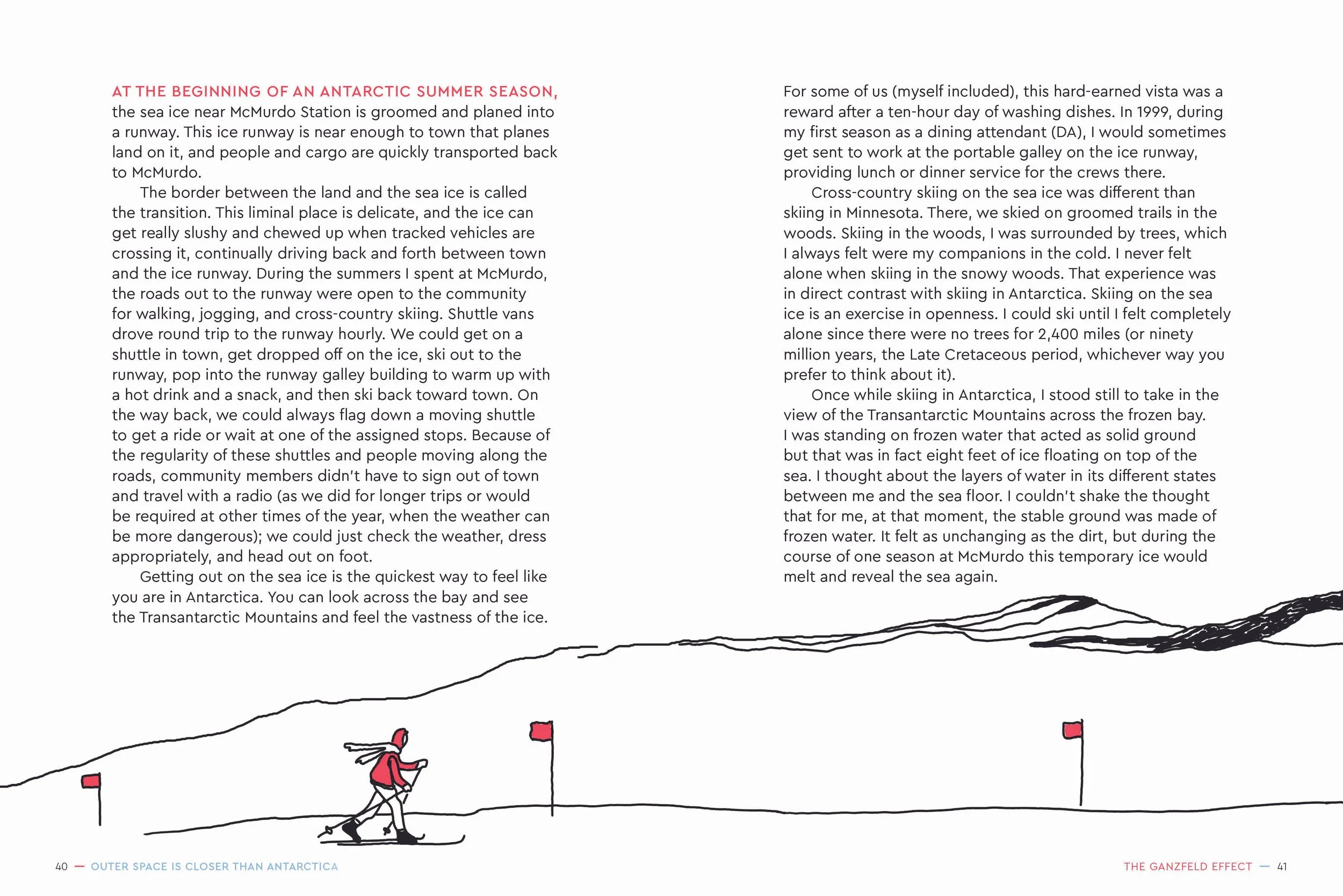
The goal of the design was to create something that was a balance of: nerdy, accessible, adventurous, and introspective, which would immediately give readers a sense of place. With the design of this book, I really wanted the illustrations to shine; this was achieved through uncluttered layouts that allowed the art to be center stage. Worked to allow the interplay of the text and art wherever possible, breaking out of the standard grid format and wrapping the text around part of the illustrations. Also collaborated with Michelle (the author) to suggest edits to select illustrations to achieve more dynamic spreads by adjusting them so that illustrations that were originally only a single page would extend into the opposite page.
Color
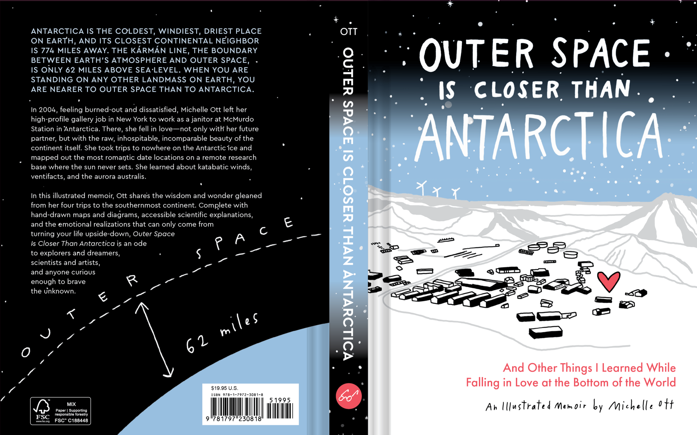
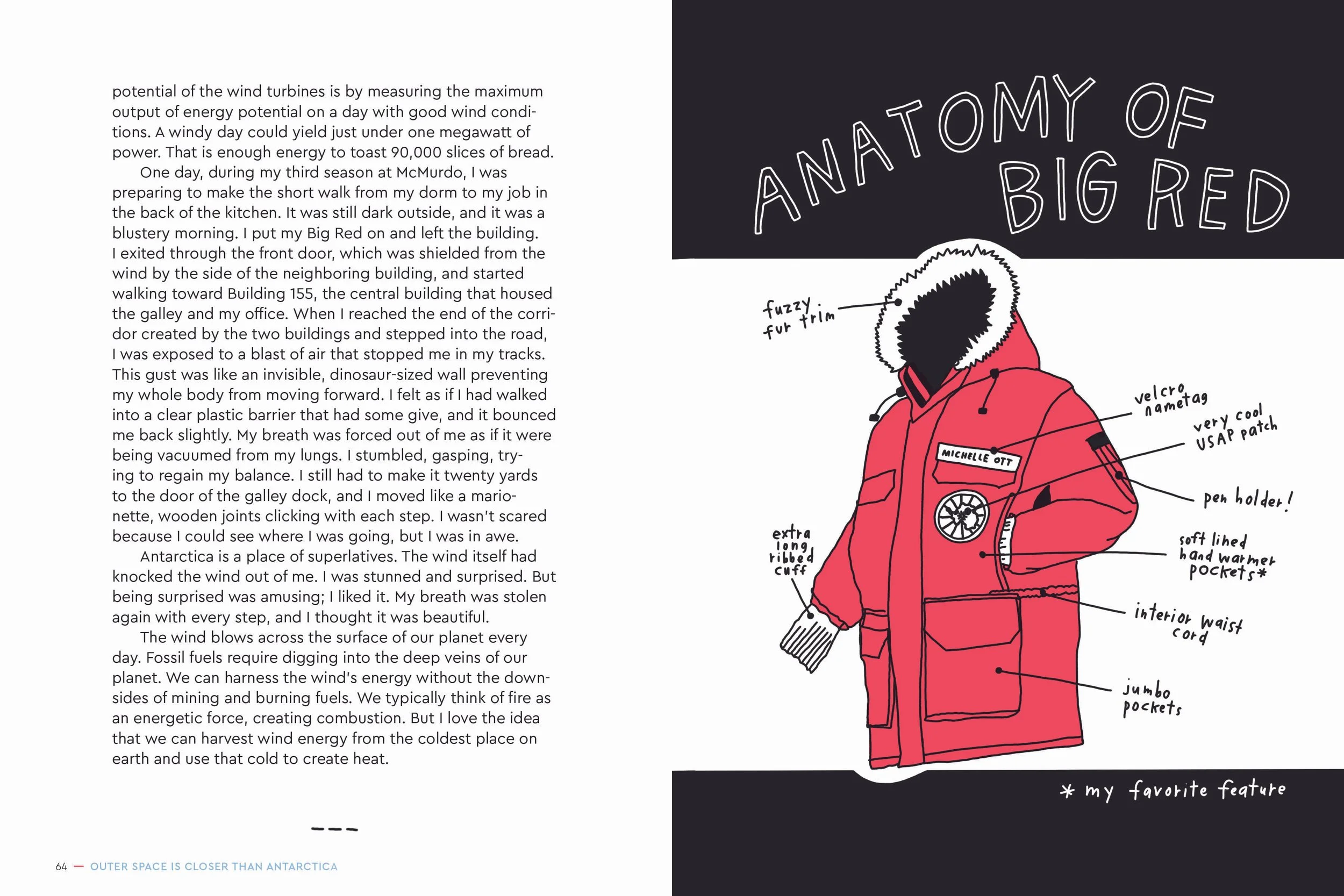
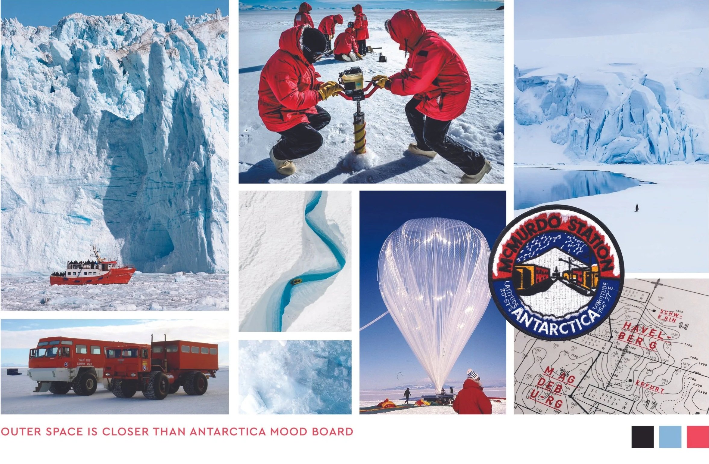
Color was a key component of the design. Spec’ed for 2PMS colors, the book features numerous black-and-white illustrations with pops of color: an icy blue and a bright red that evokes the color of “Big Red,” the standard-issue parka of those who live and work at McMurdo Station. This approach mimics the environment of McMurdo itself, a vast, stark, monochrome landscape punctuated by the bright pops of color from human presence.
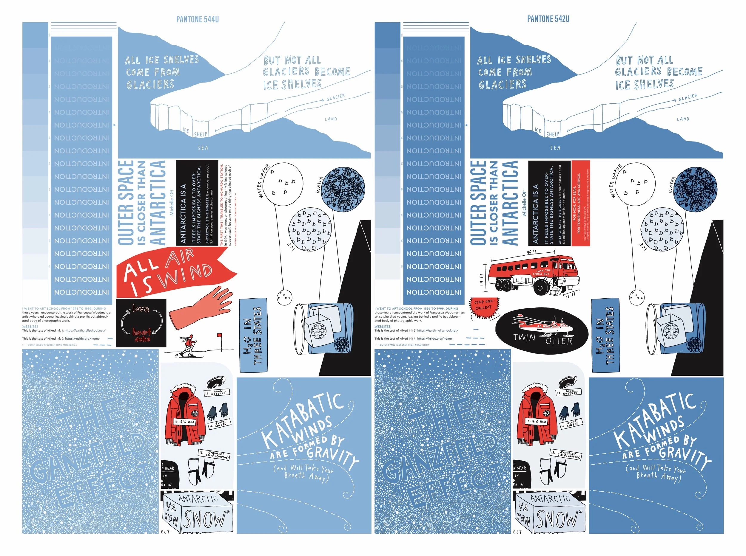
I worked closely with the author to make sure that the red selected was the perfect “Big Red” red. In our search for the perfect icy Antarctica blue, we did a tint test before landing upon Pantone 544U. In preparation for print, I undertook channeling all the artwork, using tints to create a range of colors from our limited palette.
Cover
After many iterations of the cover, ranging from ones featuring illustrations of the Antarctic continent to the “Big Red” parka, this cover was chosen as it gives an immediate sense of place. A gritty spot gloss was applied to the “snowy” parts of the cover to evoke the ice and snow that is present at McMurdo Station; the contrast of the grit vs smooth paper is really apparent when the book is in your hand.