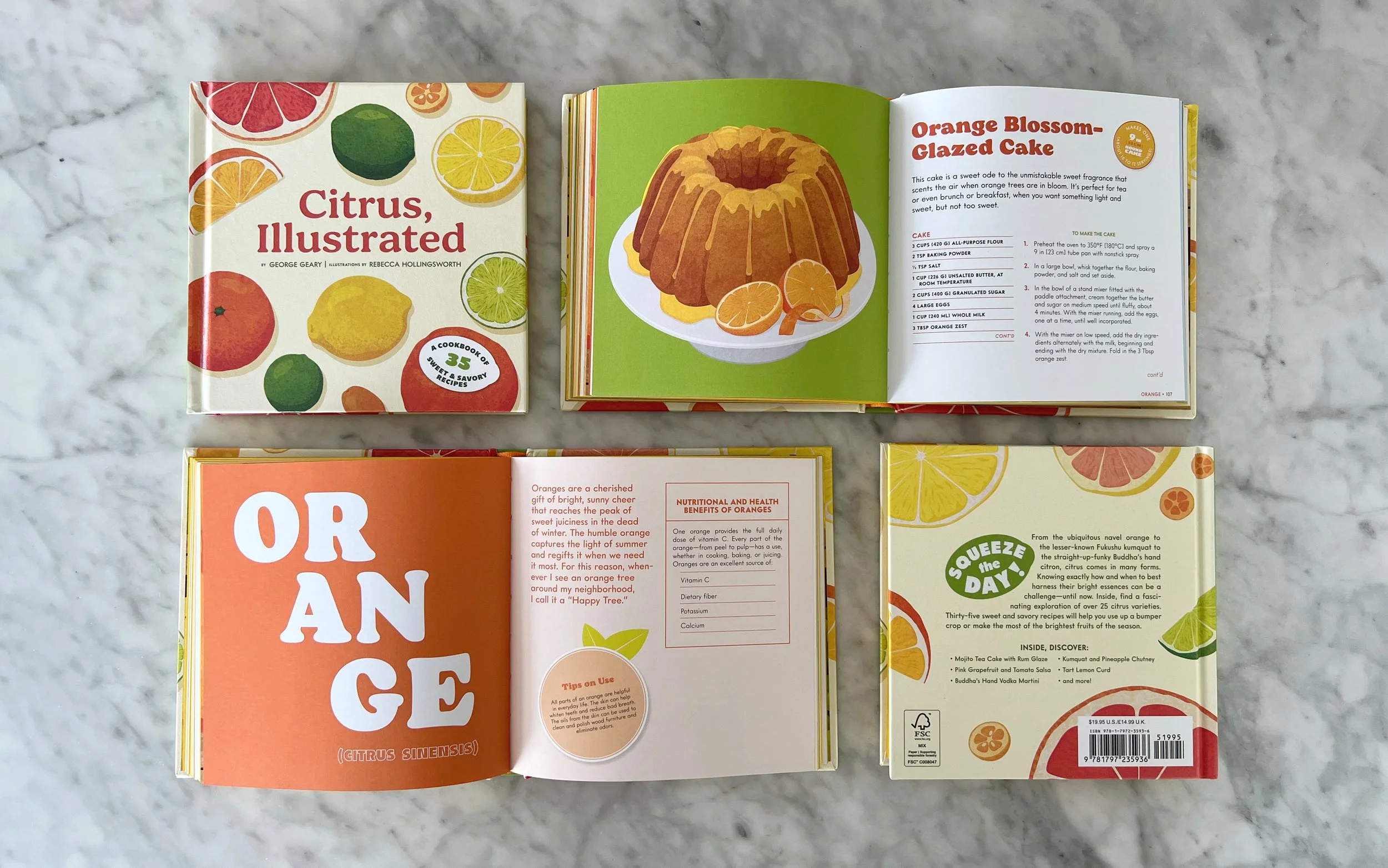
Citrus, Illustrated
A brightly illustrated guide to all things citrus! This handy little cookbook offers a fascinating exploration of over 25 citrus varieties and their many uses, from enriching simple dishes to the oils of the peel and juice of the fruit. Learn about these beautiful and practical fruits, why to cherish them, and how to put them to good use, including 35 sensational recipes
ROLE
Design (Cover + Interior)
COLLABORATORS
Creative Director: Wynne Au-Yeung
Author: George Geary
Illustrator: Rebecca Hollingsworth
Editor: Alex Galou
Publisher: Chronicle Books
PROJECT SPECS
6 × 6” / 168 pages
Citrus peel texture cover
Spot gloss on fruit illustrations
Painted edges
Direction
A gifty collection of the diverse variety of citrus – from oranges to kumquats, grapefruits, lemons, and more; with recipes to make the most of your citrus. The aim was to create a cute, fun, but practical book that would serve as a handy little reference and the perfect gift for anyone who loves citrus.
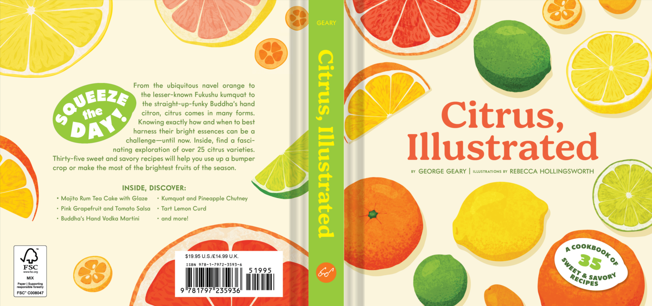
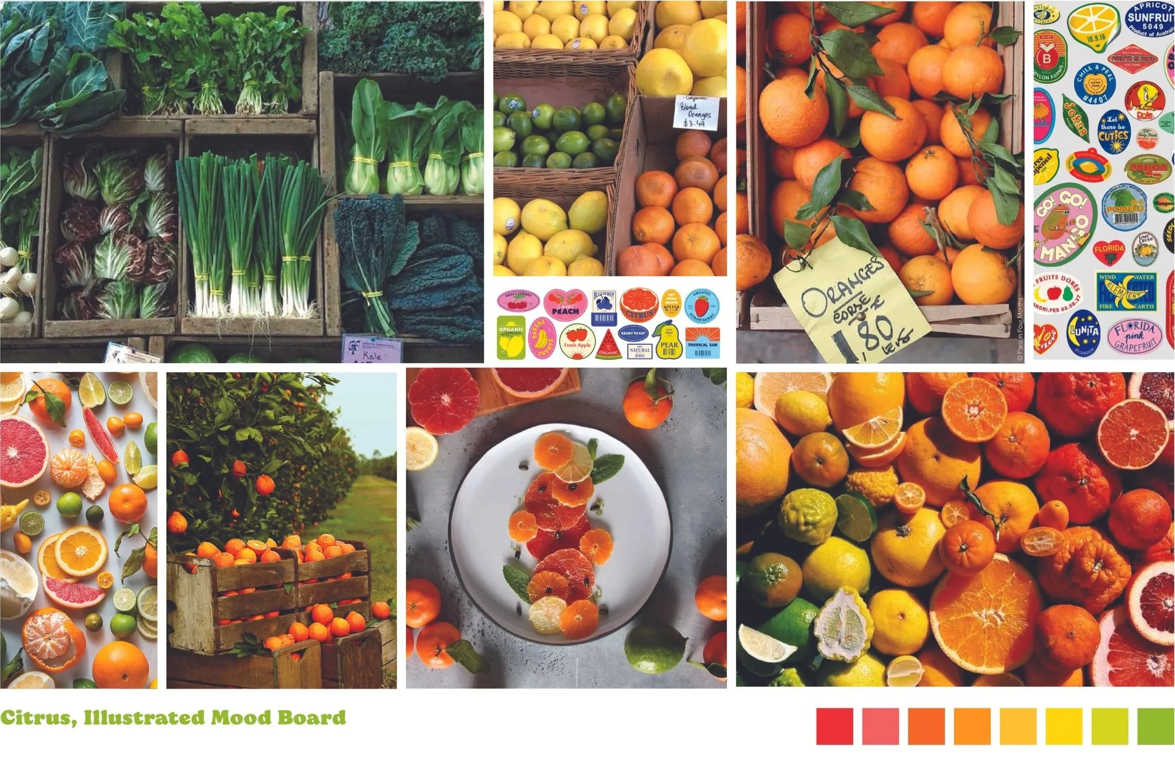
The design was inspired by farmer’s markets, stacked wooden crates overflowing with citrus, and quirky produce stickers. Featuring lots of bright, bold citrus colors throughout, making the book irresistible to pick up and flip through.
One key consideration was that Citrus, Illustrated is the third installment of Chronicle Books’ food illustrated series. So the book needed to still feel in line with its predecessors while still unique to its content. To achieve this, the trim size is identical and kept with the painted edges. While the fonts used were unique to the book, the same hierarchy was maintained: using a bolder personality-filled serif for the headers throughout, paired with a sans-serif for the body text.
Design System
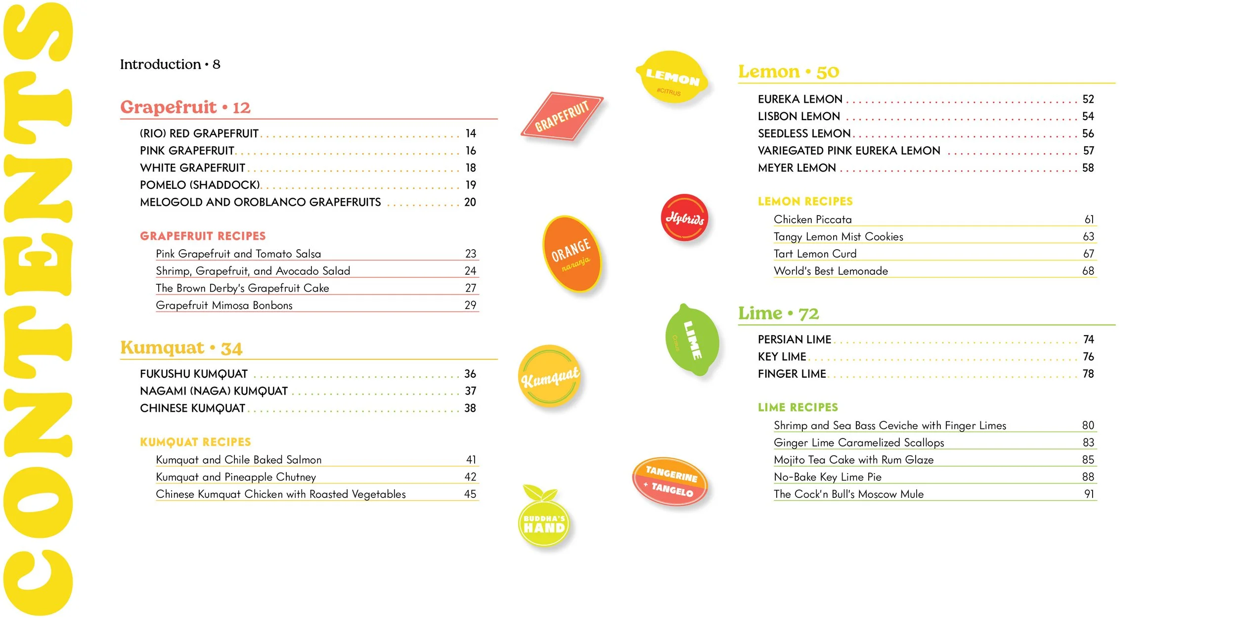
Citrus, Illustrated is divided into 8 sections, each focusing on one type of citrus (lemons, limes, etc.). To organize the contents of the book, I created a design system for each section, which included the following:
A beautiful full-spread illustration of the sub-varieties of the section’s citrus in wooden crates.
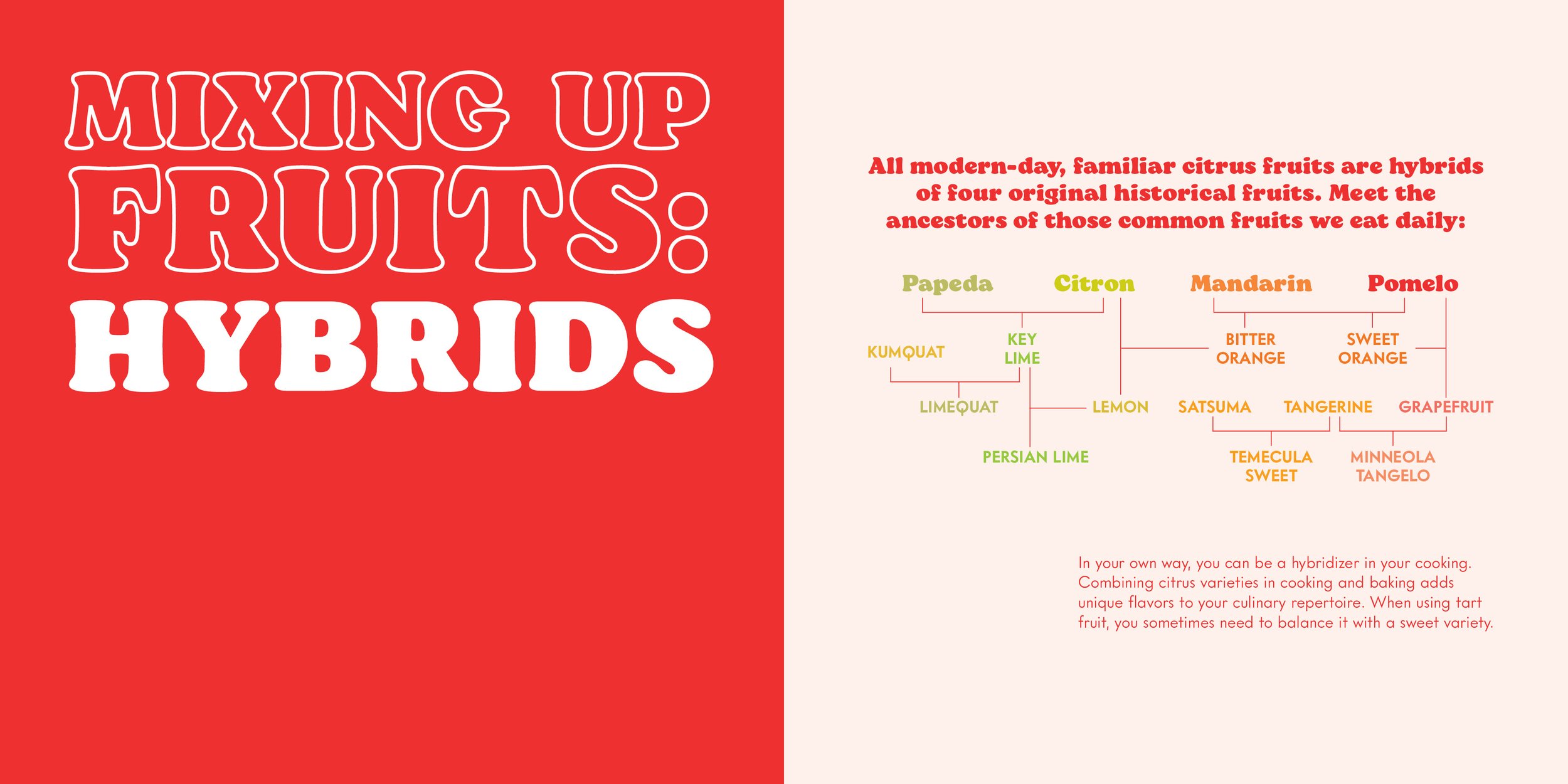
An introduction spread.
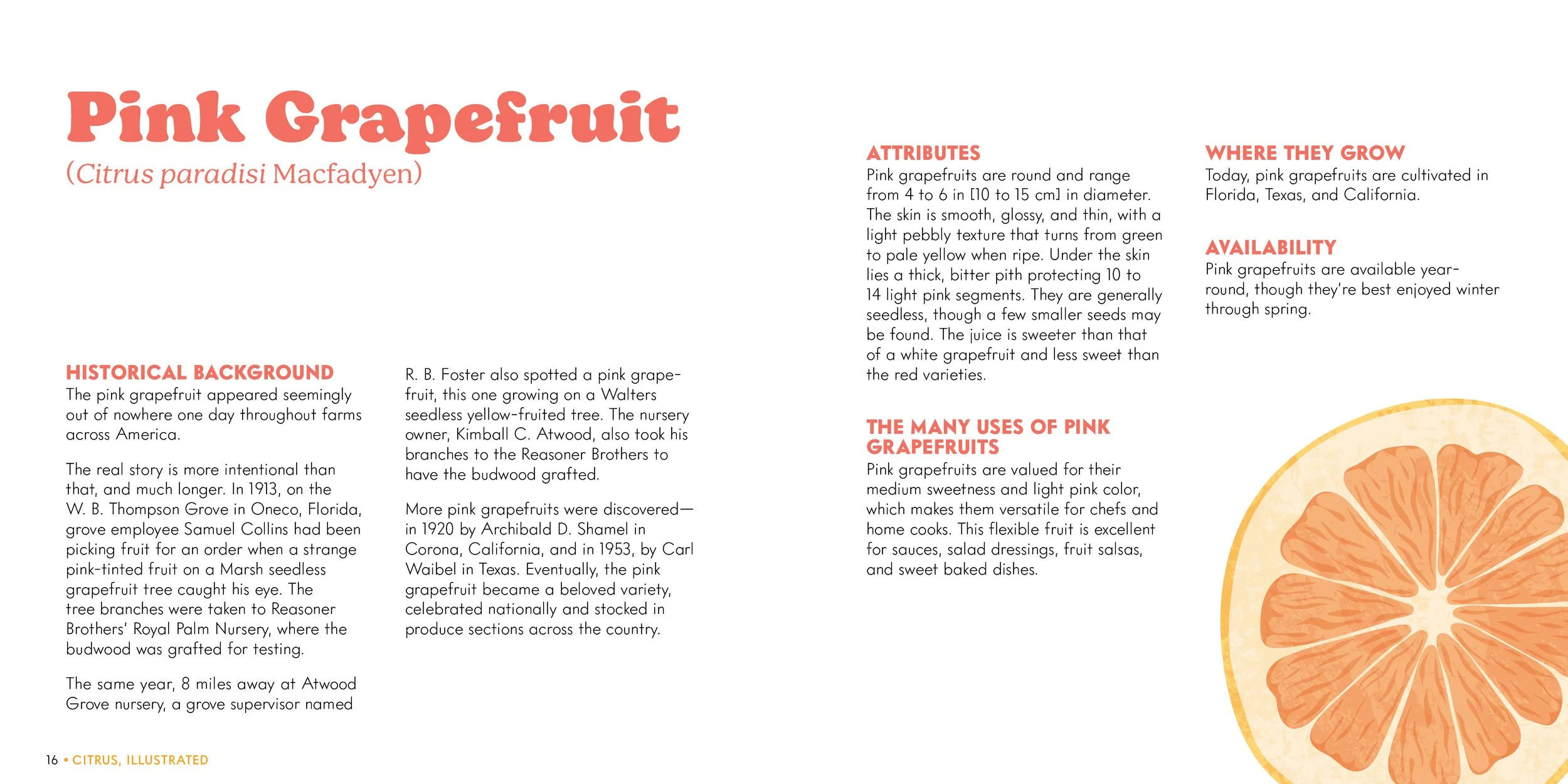
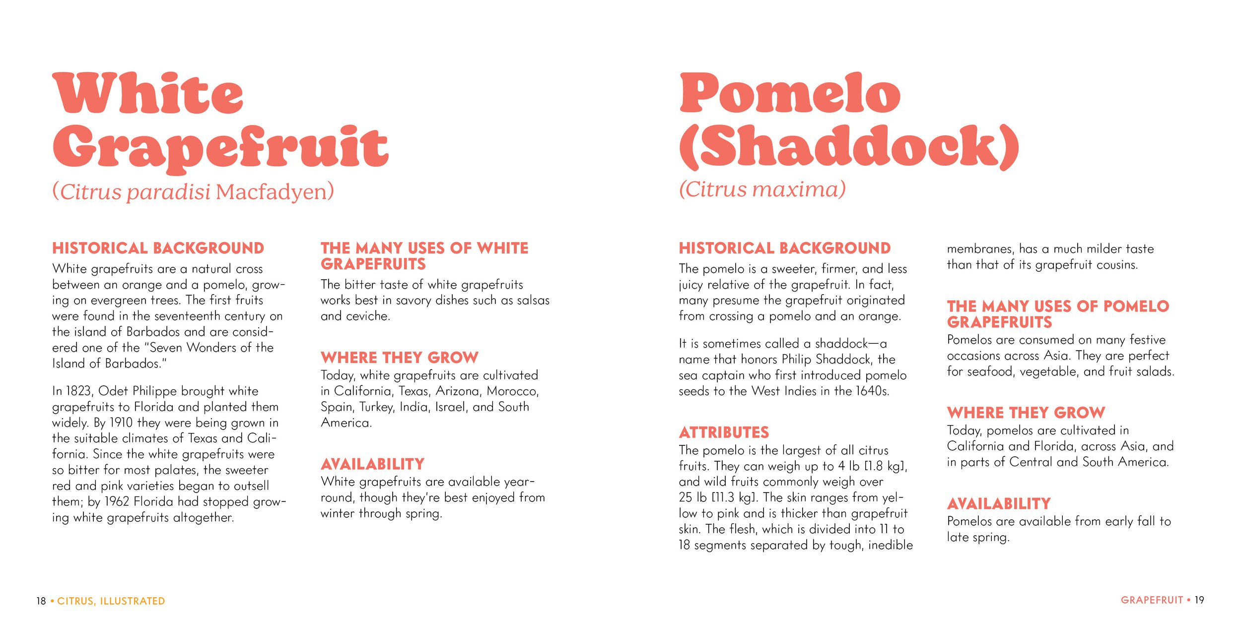
Profiles on the varieties of the fruit.
Recipes using the citrus to close the section.
Each citrus was assigned a color that was then used throughout its section. From the background of the introduction spread to the color of the header type. This helped guide the reader visually to where they were in the book.
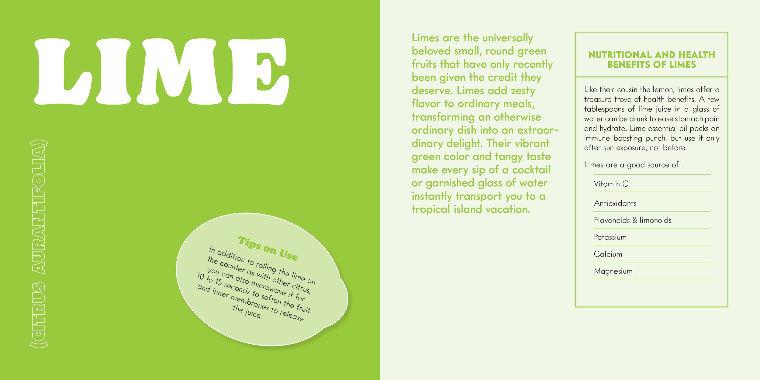
Section openers feature the name of the citrus type in large, bold type. Each opener also includes two subheaders: Nutritional and Health Benefits, which were designed to mimic the nutritional labels found on food packaging, and Tips on Use, which were designed to look like a variety of different produce stickers - a motif used throughout the design.
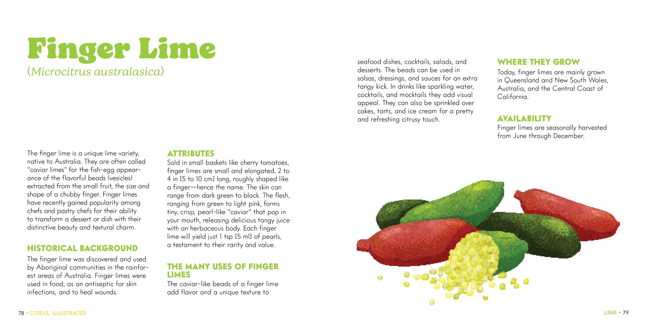
Profiles give a deep dive into each specific citrus variety. The challenge was to make sure there was room for 5 sub-heads on each profile (Historical Background, Attributes, The Many Uses, Where They Grow, and Availability), while still being flexible enough to fit the content needs, shortening to a single page if need be.
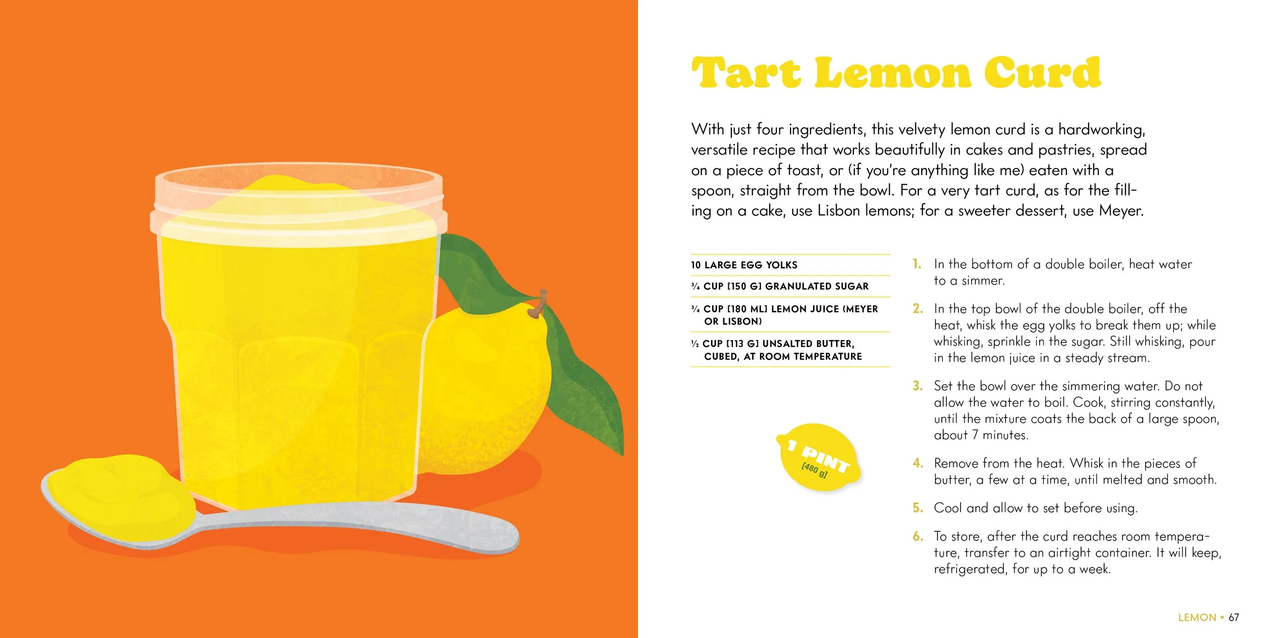
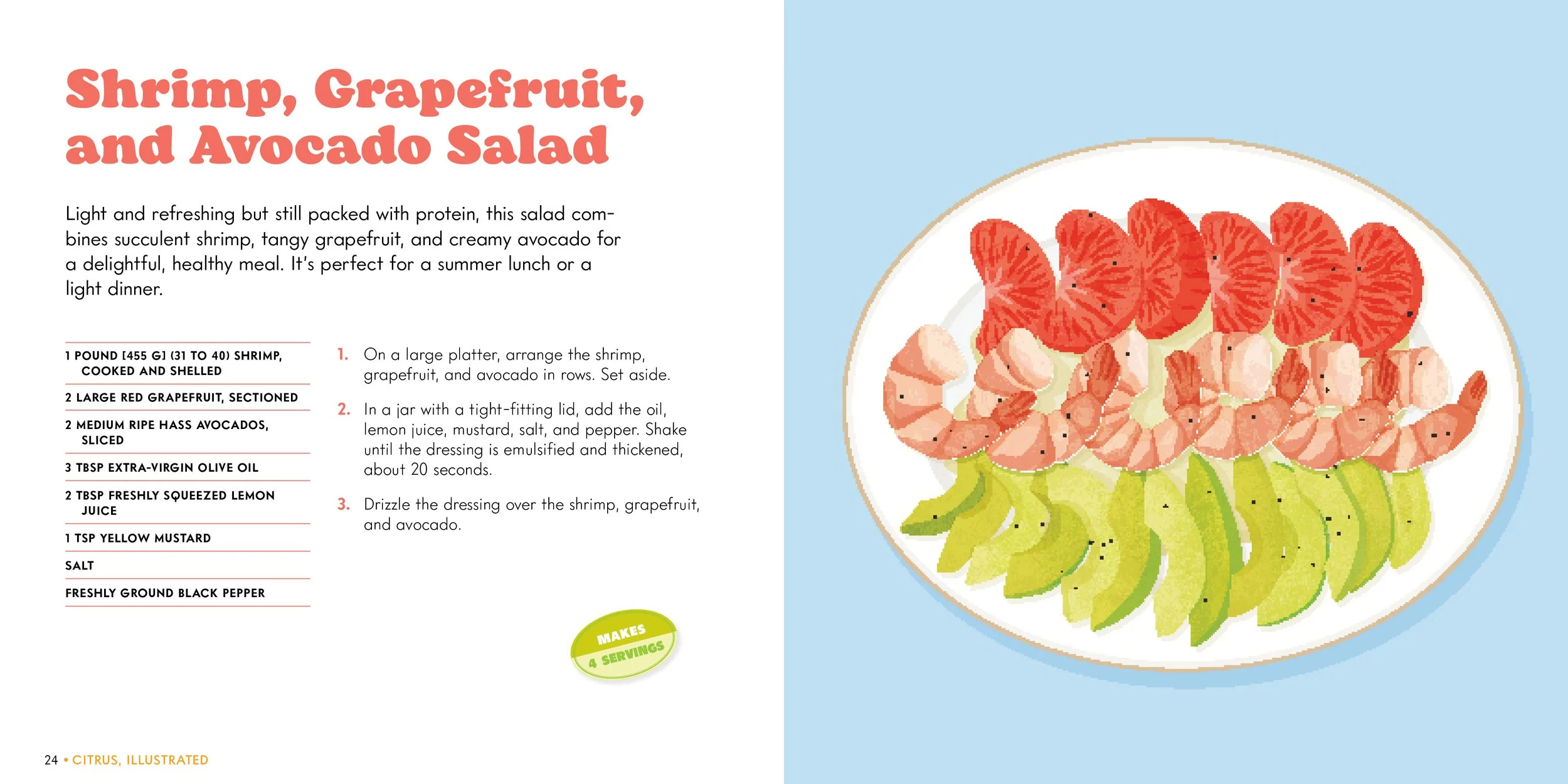
Each section finishes off with a collection of recipes that utilize the fruit. Each recipe includes a bright full-page illustration. The recipe yields continue the produce sticker motif, with each yield designed to look like a sticker placed on the page.
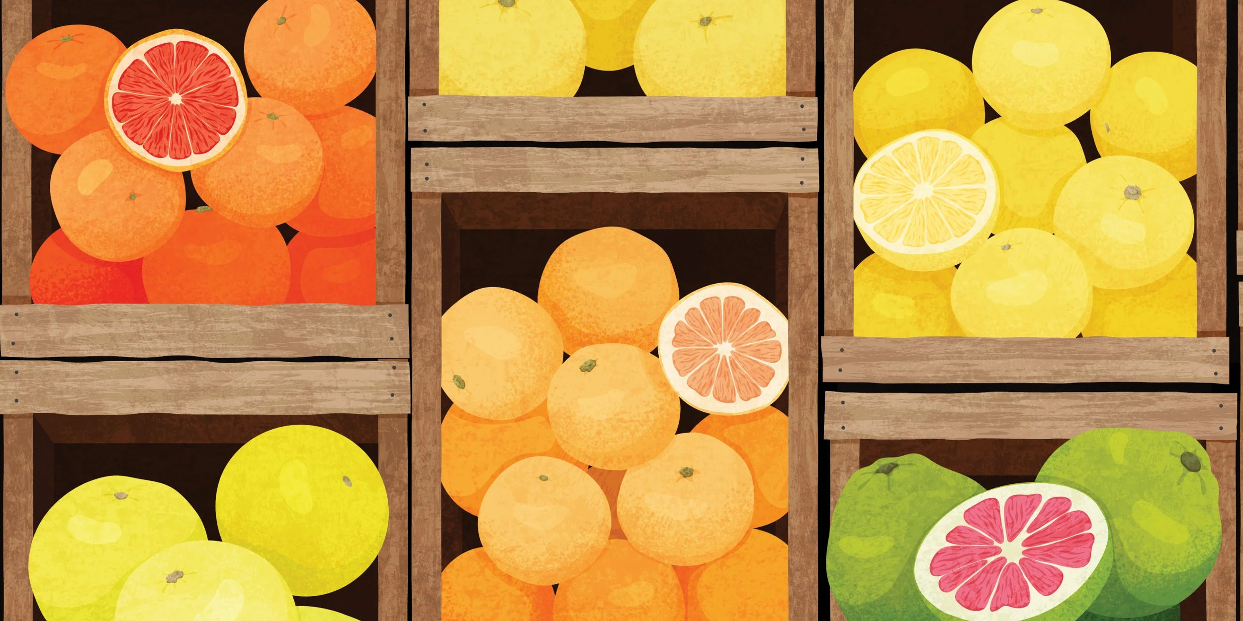
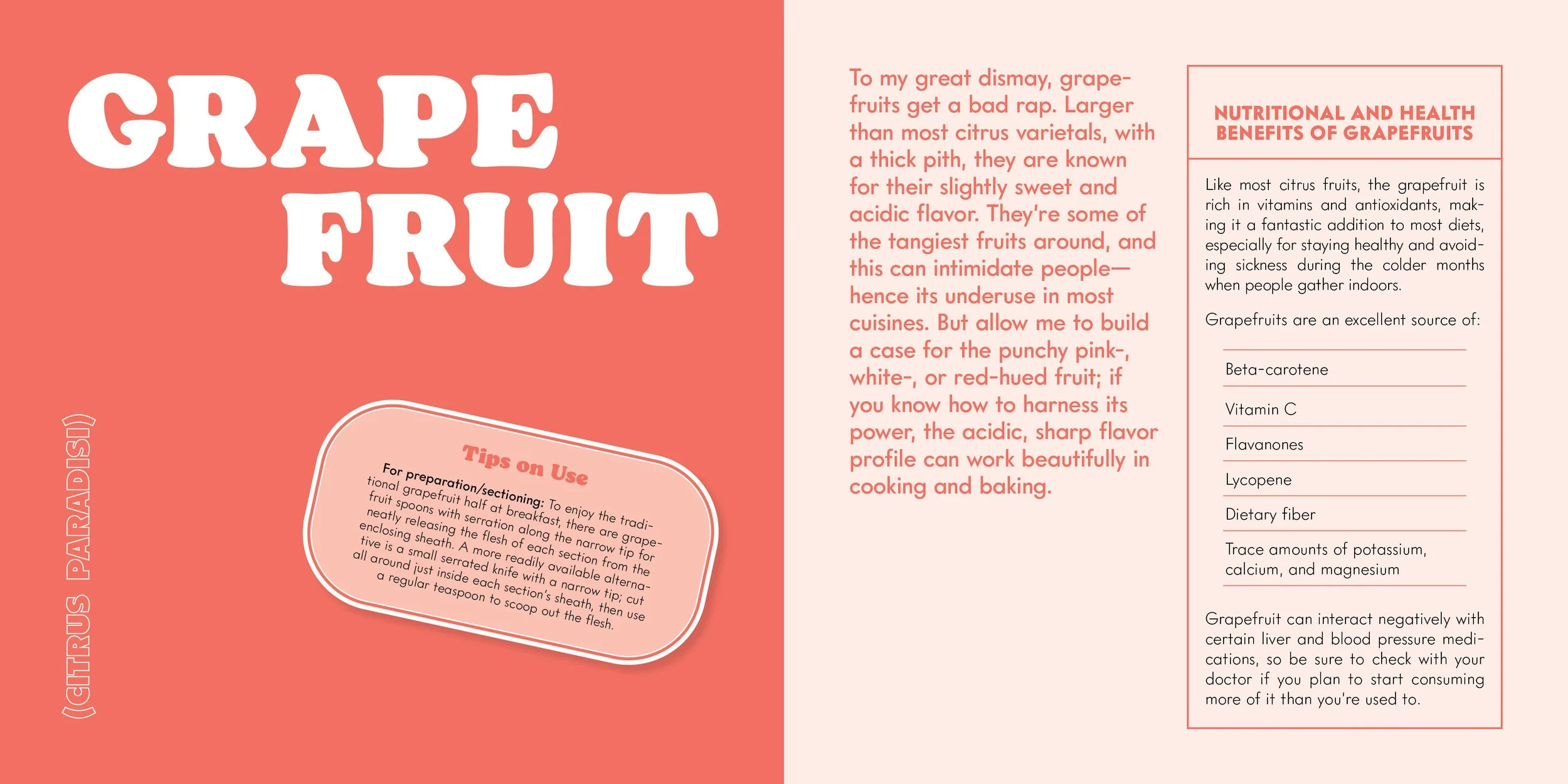
Section Opening Illustration Spread
Section Introduction Spread
Citrus Variety Profiles
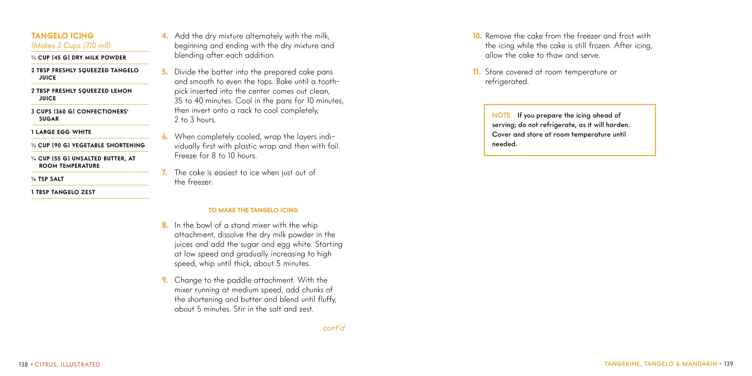
Recipe Page
Cover Explorations
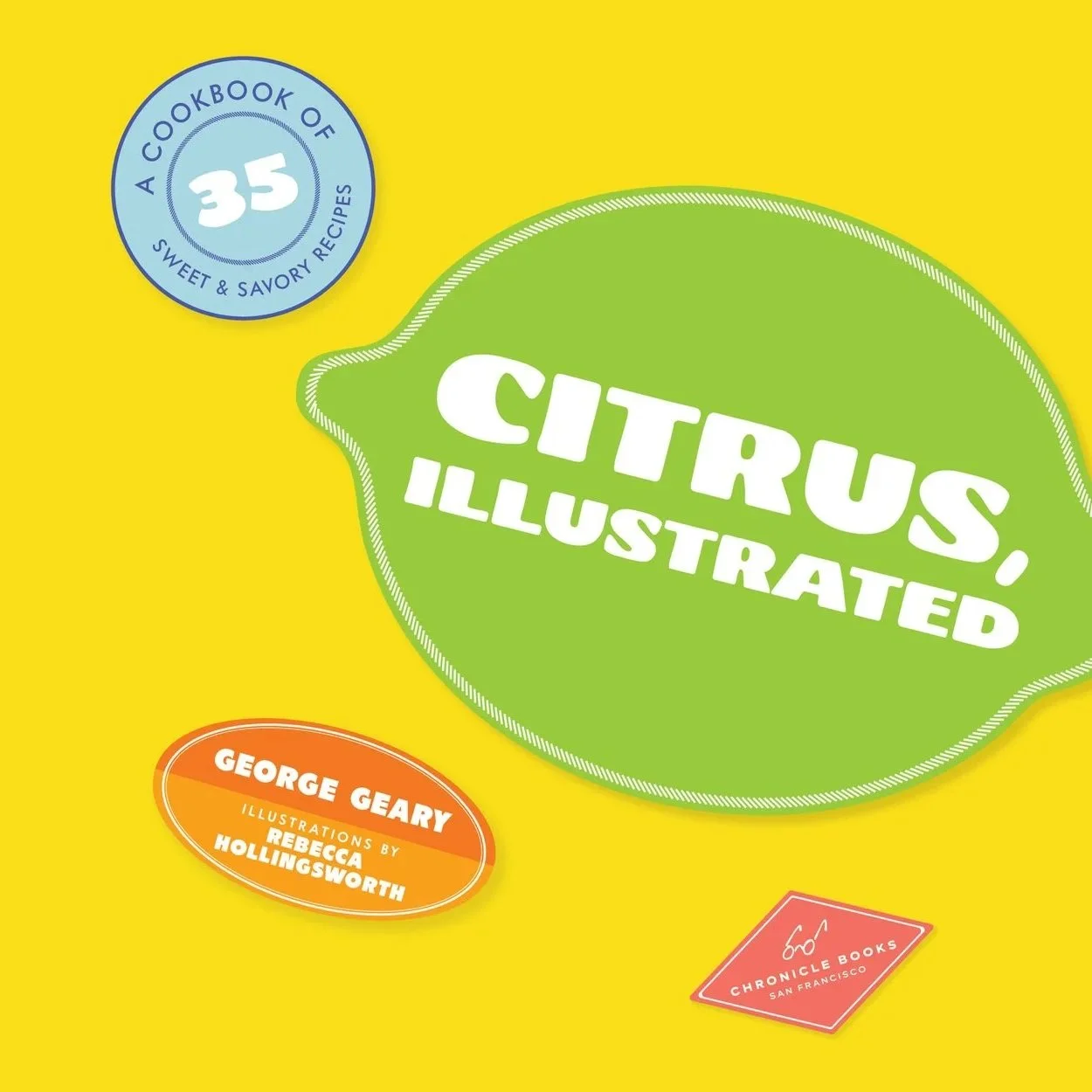
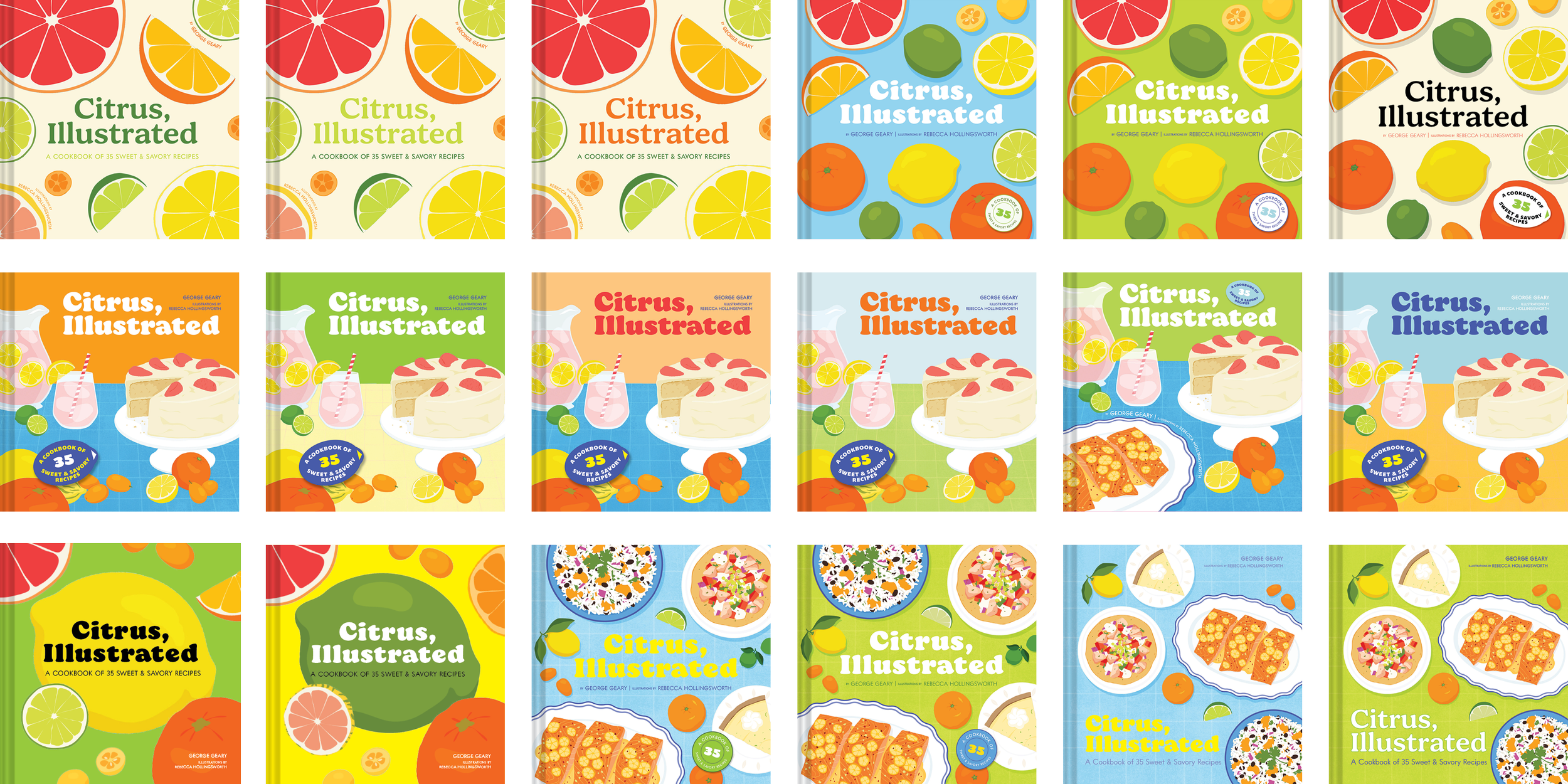
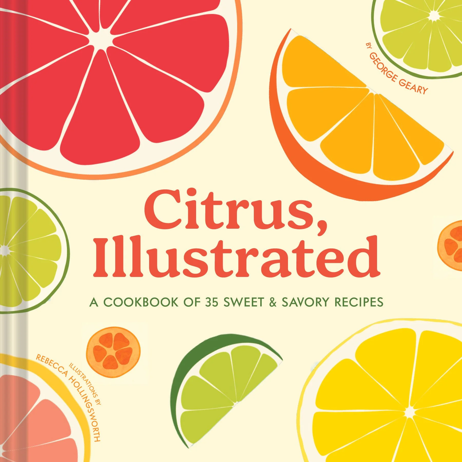
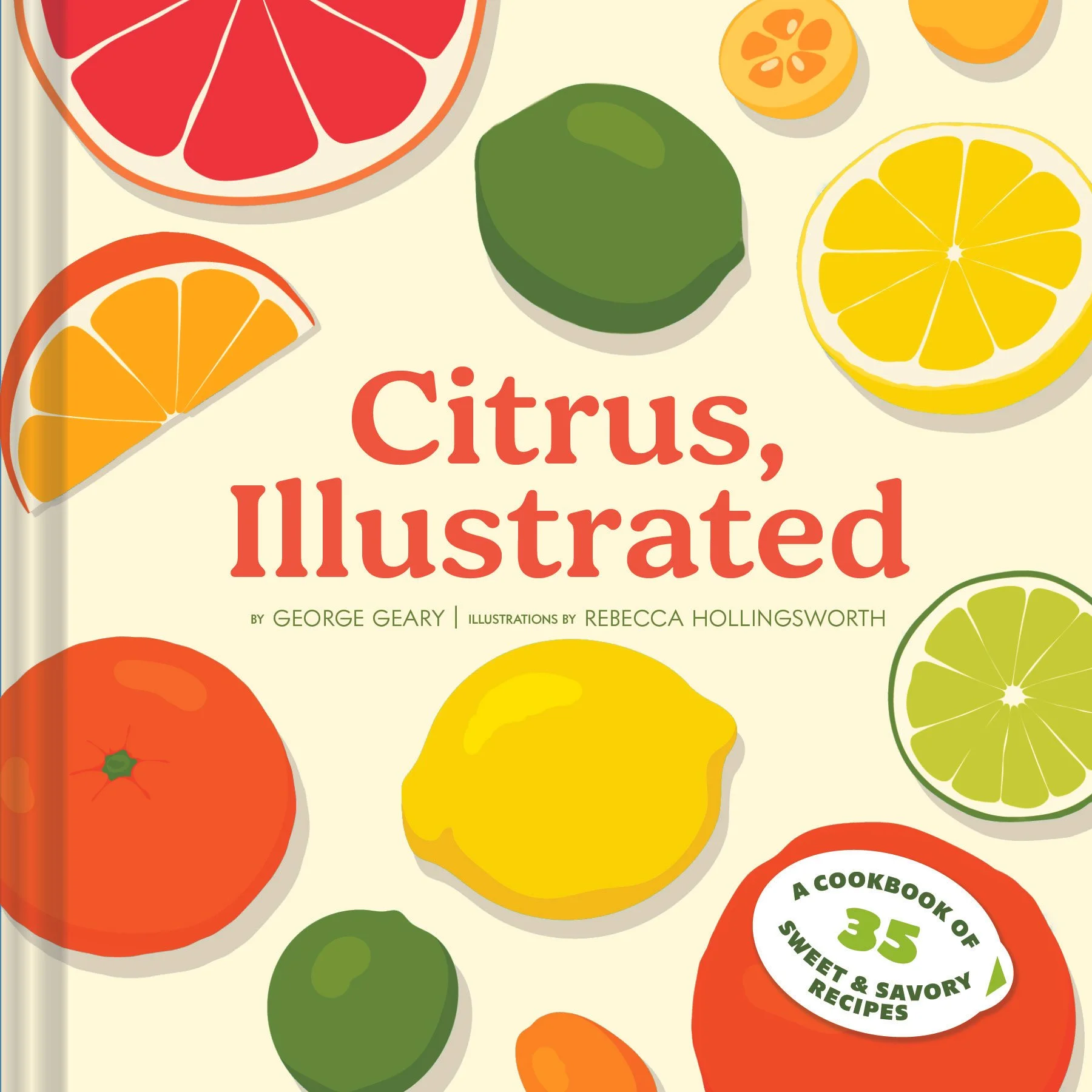
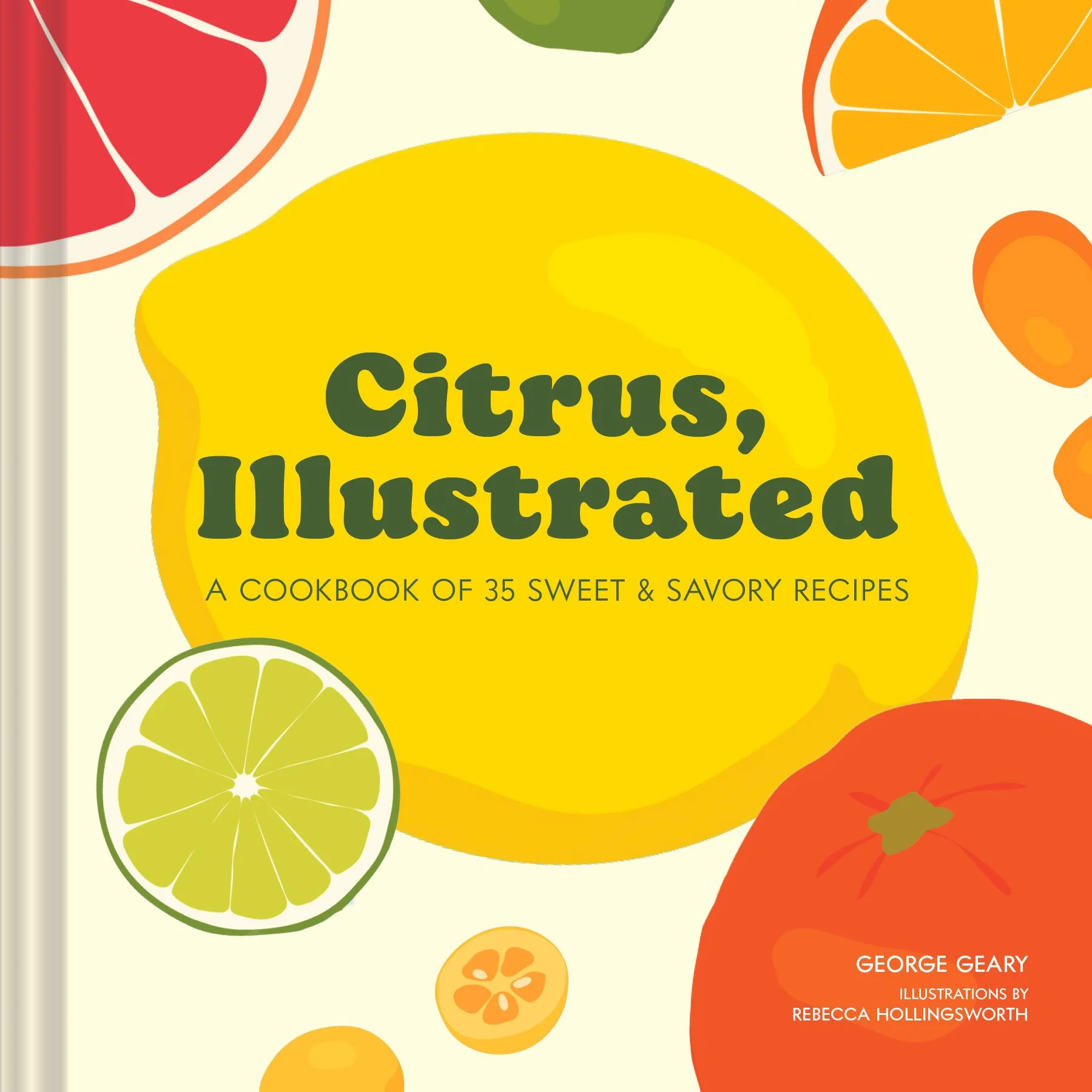
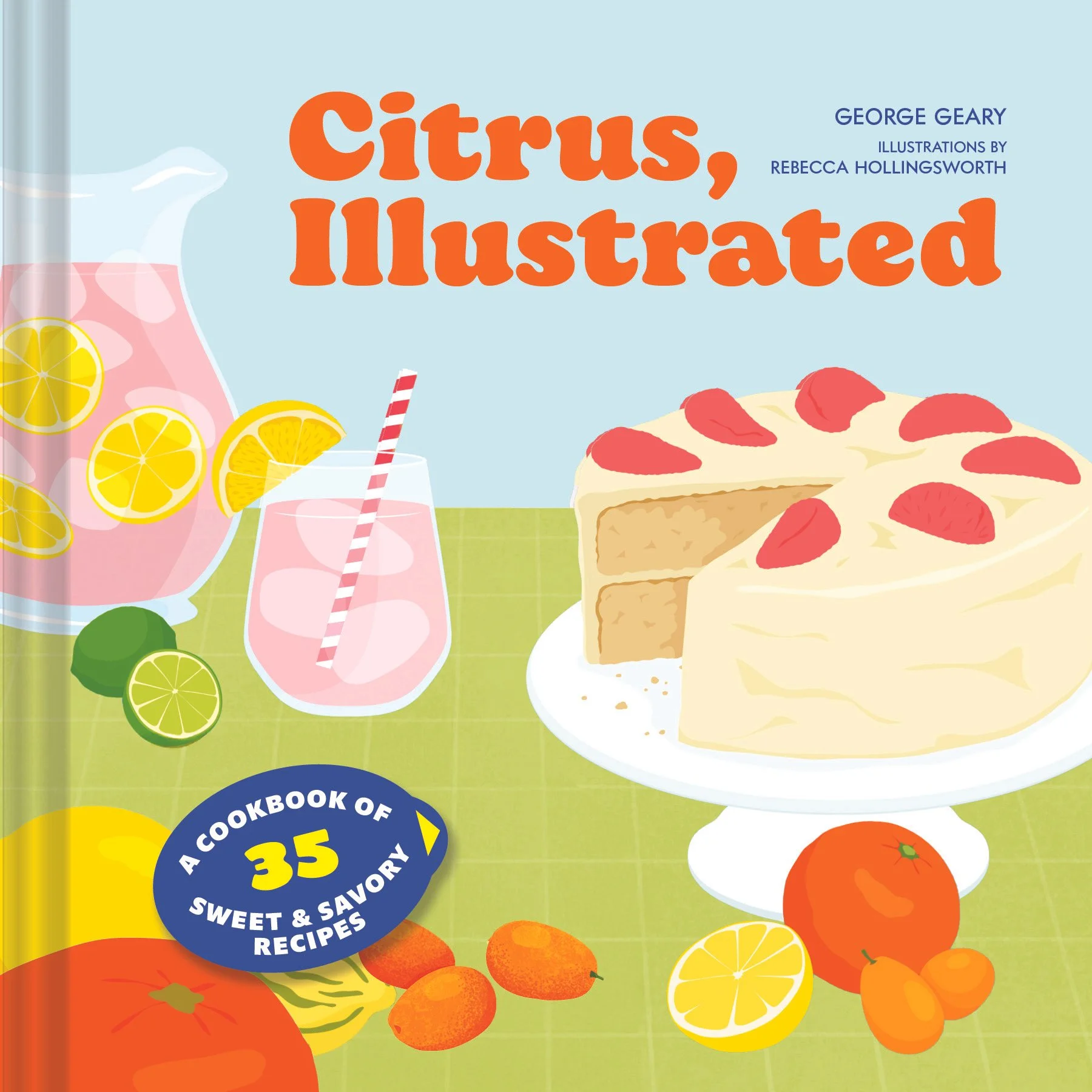
The initial cover designs explored a few different directions; some focused solely on the citrus fruits themselves, either whole or sliced, which was in line with many of the comps. Other options featured a tablescape scene with dishes included in the book’s recipes, leaning into the popularity of illustrated cookbook covers. Both color and font options were explored in this initial stage.
Feedback and Revisions
After sharing the initial cover options with the stakeholders and then a few more rounds of iteration, the covers were narrowed down to the following four options. While cute, it was decided to move away from the tablescape options since the team worried it might lean a little too cookbook-y, which would disregard the great reference content included. The options with the myriad citrus highlighted the wide array of citrus covered by the book and were also much more in line with Cheese, Illustrated, one of the series' previous installments, and thus considered the route to go on the cover.
Final Cover and Special Effects
To finish, a paper grain texture reminiscent of citrus peel was added along with spot gloss on the fruit illustrations. The book block was painted a bright lemon yellow.